
You're probably looking at one of two living room problems right now. Either the wall above the sofa is completely blank and making the whole room feel unfinished, or you already hung something there and it looks oddly small, too busy, or just disconnected from the rest of the space.
That's why canvas wall art for living room walls matters so much. In most homes, the living room is where seating, lighting, conversation, and first impressions all meet. The art you choose doesn't just fill space. It sets scale, mood, and direction for the room.
The good news is that this doesn't have to feel mysterious. A few sizing rules, a clear sense of finish and framing, and a smarter way to match color can take you from stuck to certain. If you also want a helpful reset before you start shopping, this framed art refresh guide is a useful place to gather ideas for what your room may be missing.
Table of Contents
- Transform Your Living Room from Blank to Beautiful
- Choosing Your Canvas Material Finish and Frame
- The Art of Sizing Canvas Wall Art for Your Sofa
- Matching Canvas Art to Your Living Room Style
- Layout and Arrangement Rules for a Polished Look
- From Ordering Online to Hanging on Your Wall
- Frequently Asked Questions About Living Room Canvas Art
Transform Your Living Room from Blank to Beautiful
A blank wall behind a sofa can make even good furniture look temporary. I see this often in otherwise lovely rooms. The rug works, the lighting is fine, the seating is comfortable, but the wall never got a decision. So the room stays in limbo.
Canvas art is usually the easiest way out of that dead zone because it adds scale without the heaviness of a large mirror or the visual noise of lots of small accessories. It can be calm, bold, minimal, textured, or colorful, depending on what the room needs.

Interest in this category is also very real. In the United States, “wall art for living room” is searched more than 12,100 times per month and “canvas wall art” receives 9,900 searches per month, according to this living room canvas art search and styling guide. That tells you plenty of people are trying to solve the same problem.
What changes when the right piece goes up
The shift is usually immediate:
- The sofa feels anchored because the wall and furniture finally relate to each other.
- The palette looks intentional when the artwork repeats tones from pillows, a rug, or curtains.
- The room gains personality without needing more small décor on every surface.
A living room rarely feels finished when the largest wall is still undecided.
If you're drawn to multi-panel arrangements, this guide to choosing 3 piece artwork offers helpful examples of how a grouped format can create presence without feeling bulky.
The biggest mistake isn't choosing the wrong style first. It's assuming any art will work as long as you like the image. In living rooms, size, placement, and finish matter just as much as subject matter. Once those pieces line up, the wall stops feeling like a problem and starts acting like the room's focal point.
Choosing Your Canvas Material Finish and Frame
Most buying mistakes happen before the artwork ever reaches the wall. People focus on the image and ignore the physical format. In a living room, that's backwards. Material, finish, and frame shape how the art reads in daylight, lamplight, and from across the room.
Start with the finish
The finish affects glare, color feel, and how formal the piece appears.

A matte look tends to work well in living rooms with a lot of natural light, especially if windows face the wall at an angle that creates reflection. It softens the surface and gives the art a quieter presence. That's useful when the room already has strong elements like patterned upholstery, a fireplace surround, or a dramatic light fixture.
A more reflective finish gives stronger contrast and richer visual punch. It can suit a room that feels flat or underlit, but it also shows glare more quickly. If your seating area gets direct sunlight or you watch television in the same zone, a shinier finish can compete with comfort.
Think about texture, not just color
Canvas has a different effect from smooth paper behind glass. It feels less rigid and often integrates more naturally into relaxed living rooms. That's one reason people choose it over framed poster-style art. The surface carries image and texture together, which helps large pieces feel substantial without feeling too formal.
Practical rule: If the room already has reflective surfaces like glass tables, polished stone, or glossy cabinetry, a softer canvas finish usually balances the space better.
Frame choice changes the style language
The frame isn't just a border. It tells the room how to read the art.
Here's the simplest way I break it down for clients:
- Gallery-wrapped canvas feels cleaner and more modern. The image continues around the edge, so the piece reads as minimal and architectural.
- Floater-framed canvas adds definition. It creates a slim visual gap around the art, which makes the canvas feel more finished and often more refined in a living room.
- Traditional framing around canvas can work in classic interiors, but it needs to relate to other finishes in the room or it can feel tacked on.
If you want to see how that shadow-gap effect changes the final look, this overview of floating frame prints is worth a look.
What works and what doesn't
A few trade-offs are consistent across projects.
- What works: soft matte finishes in bright rooms, floater frames for transitional interiors, and gallery wraps for pared-back spaces.
- What doesn't: heavy ornate framing in casual rooms, high glare surfaces opposite windows, and choosing a frame color that doesn't connect to anything else nearby.
- What needs care: very bold canvas texture with very detailed imagery. Sometimes the surface and the subject compete.
When in doubt, match the physical format to the room's architecture first, then choose the image. That order saves people from a lot of expensive near-misses.
The Art of Sizing Canvas Wall Art for Your Sofa
If art looks wrong above a sofa, the problem is usually scale. Not color. Not style. Scale.
Often, art buyers choose pieces that are too small, as they prioritize the image first and the wall relationship second. In a living room, that almost always leads to a piece that floats awkwardly over the furniture instead of feeling connected to it.
Use the sofa as your sizing anchor
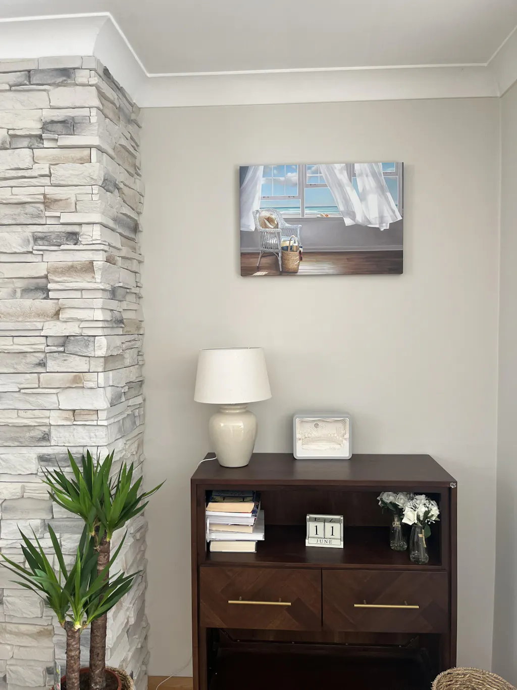
A widely used display rule is that wall art above a sofa should span about two-thirds of the sofa's width, with the bottom edge placed 6 to 8 inches above the sofa back. For example, an 84-inch sofa typically calls for canvas artwork around 56 inches wide, while a 60-inch loveseat points to a canvas around 40 inches wide. That guidance appears in the source noted earlier in this article.
That rule works because the eye wants the wall art and the seating below it to read as one composition. When the art is much narrower, it looks isolated. When it's too wide, it can overpower the furniture and make the wall feel cramped.
A quick reference guide
| Sofa Width | Recommended Canvas Width (approx. 2/3) |
|---|---|
| 60-inch loveseat | 40 inches |
| 84-inch sofa | 56 inches |
This isn't a hard law. It's a strong starting point. If the piece has a very light visual weight, you might go a bit larger. If it has a dark, dense image or a heavy frame, staying closer to the core proportion usually looks better.
Single large canvas or grouped pieces
A single oversized canvas creates the calmest result. It's clean, easy to center, and especially effective in rooms that already have patterned textiles or open shelving elsewhere.
A multi-panel arrangement can also work well, but the full grouping should still relate to the sofa width as one unit. Don't size each panel in isolation. Think of the total footprint once the pieces are arranged together. If you're considering that route, this article on 3 piece wall art helps clarify how grouped canvases behave differently from one wide statement piece.
Too-small art doesn't make a room feel minimalist. It makes it feel unresolved.
What I look at before finalizing size
I usually check four things before recommending a width:
- The sofa arms and silhouette: a low modern sofa can carry a larger-feeling piece than a tall rolled-arm sofa.
- The wall margins: if the sofa sits close to a window or built-in, the art needs breathing room on both sides.
- The visual weight of the image: soft natural scenes read lighter than dark abstracts with dense contrast.
- The nearby competition: a bold fireplace, shelving unit, or oversized floor lamp changes how large the art should feel.
For broader room-scale inspiration, this roundup of expert advice on wall decor is a useful companion because it shows how large art behaves in bigger wall situations, not just above sofas.
Common sizing mistakes
The most common misses are easy to spot once you know them:
- Choosing by available print size instead of ideal wall size
- Leaving too much empty wall around the piece
- Using narrow vertical art above a long horizontal sofa
- Treating grouped art as separate pieces rather than one composition
When buyers get sizing right, the rest of the room usually comes together faster. Rugs, pillows, and accent chairs start looking more intentional because the main wall finally has the right scale.
Matching Canvas Art to Your Living Room Style
Style matching gets overcomplicated. You don't need to decode your entire design identity before choosing art. You need to know what the room already says, then pick canvas art that supports that message instead of interrupting it.

Modern rooms need restraint
In a modern living room, furniture often carries clean lines and deliberate negative space. The art should respect that. Abstract forms, tonal photography, geometric compositions, and large pieces with strong shape tend to work better than fussy detail.
If the room already has black accents, sculptural lighting, or a low-profile sofa, a crisp canvas with a gallery wrap or slim floater frame usually feels aligned. What doesn't work as often is overly sentimental imagery with a lot of visual clutter. It breaks the architecture.
Soft neutral rooms need depth
Scandinavian, organic modern, and quiet minimalist rooms can look beautiful but slightly unfinished if every surface stays in the same value range. That's where canvas art helps. A misty scene, a textural abstract, or botanical subject matter can bring movement without making the room loud.
For this kind of space, color matching matters more than people think. Pull one or two tones from the rug, throw blanket, or curtains and repeat them in the artwork. A site feature like Shop by Color is useful here because it narrows choices by palette instead of forcing you to scroll through unrelated styles. Printano also organizes work into curated collections, which helps when you know the feeling you want but not the exact image yet. If your room leans pared-back, this guide to wall decor for a minimalist approach offers a good visual direction.
The right art doesn't match every item in the room. It repeats the room's logic.
Layered eclectic rooms can handle personality
Bohemian, collected, and globally influenced living rooms have more flexibility. Richer color, expressive brushwork, figurative subjects, and multi-piece arrangements can all work. In these rooms, canvas art often acts as a bridge between textiles, wood tones, and plants.
That said, “eclectic” doesn't mean random. The image still needs at least one shared language with the room. Maybe that's terracotta, olive, indigo, curved lines, or natural subject matter. Without that connection, the wall starts to feel like a separate project.
A simple way to choose when you're stuck
If clients feel overwhelmed, I usually have them choose one of these routes:
- Match the palette if the room already has a clear color story.
- Match the mood if the room's colors are mixed but the feeling is consistent.
- Match the architecture if the room has strong lines and materials but little decoration.
That approach cuts through choice paralysis quickly. Style becomes easier when you stop asking, “Do I like this art?” and start asking, “Does this piece speak the same language as my living room?”
Layout and Arrangement Rules for a Polished Look
Good art can still look wrong if the layout is off. Hanging is where many living rooms lose that finished, designerly feel. The fix usually comes down to alignment, spacing, and resisting the urge to place everything too high.
A clear visual guide helps before you touch the wall.

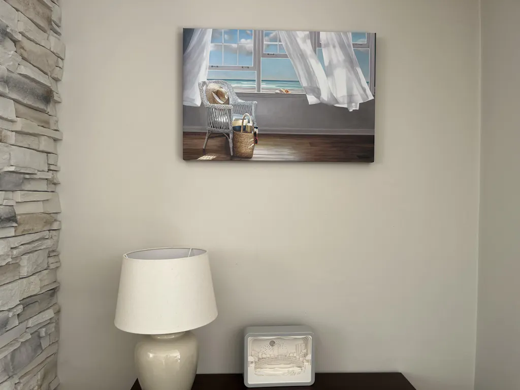
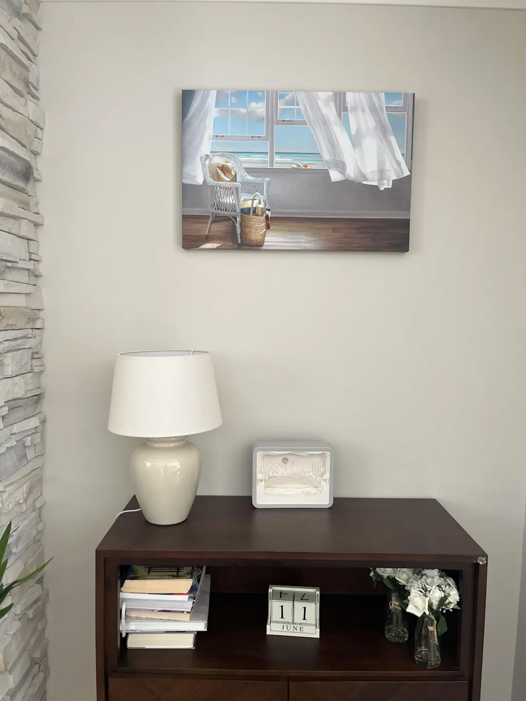
Expert hanging guidance places the center of the canvas at about 57 to 58 inches from the floor, keeps the piece 6 to 12 inches above furniture, and uses 2 to 6 inches of spacing between grouped canvases depending on size. For ceilings above 9 feet, guidance recommends raising artwork slightly, about 2 to 3 inches per additional foot of ceiling height, according to this canvas art placement guide.
The eye-level rule that solves most problems
The center-point rule works because it keeps the art where people see it while seated and standing. In living rooms, hanging too high is common because people react to the empty wall above the sofa instead of the furniture below it.
If you only remember one thing, remember this: the artwork belongs to the seating zone, not to the ceiling.
Groupings need disciplined spacing
Diptychs, triptychs, and salon-style arrangements can look great in living rooms, but only when the spacing is consistent. Uneven gaps make the whole arrangement feel accidental.
Use these principles:
- Keep grouped canvases visually connected by treating them as one unit.
- Repeat the gap between pieces rather than adjusting by eye every time.
- Align with intention. Tops, centers, or bottoms can all work, but casual misalignment usually doesn't.
Later in the process, examples of decorating with sets of framed art can help you compare different grouping styles before hanging.
This short video is a useful companion if you like seeing placement in action.
Real-world adjustments that matter
Rooms aren't diagrams, so some judgment is always needed.
- High ceilings: raise art slightly so it doesn't sink visually into a tall wall.
- Deep sofas or tall backs: check the measurement from the furniture, not just from the floor.
- Open-plan living rooms: view the arrangement from adjoining spaces, because angles expose imbalance quickly.
Layout looks polished when the spacing feels intentional and the art relates clearly to the furniture below it.
Before hanging, I almost always recommend paper templates or painter's tape outlines on the wall. It takes a little extra time and prevents the classic cycle of nail, patch, repaint, repeat.
From Ordering Online to Hanging on Your Wall
Buying canvas art online is convenient, but it asks you to make decisions without seeing the piece in your room first. That means your checklist matters. A smart order starts with format, orientation, and size, then moves to practical details like shipping, returns, and how the piece will arrive.
What to check before you order
I look for a few basics every time:
- Material details: make sure the site clearly describes the canvas format and hanging readiness.
- Orientation options: horizontal, vertical, and square aren't interchangeable once you've planned the wall.
- Return clarity: art is visual. Sometimes a piece is right on screen and wrong in the room.
- Tracking and packaging information: large wall décor needs predictable delivery and decent protection.
Some retailers also reduce decision fatigue with browsing tools. Filters by color, orientation, and collection are helpful when you're trying to match a rug, sofa fabric, or accent chair rather than browse aimlessly. Printano, for example, offers canvas wall art along with color-based browsing, curated collections, secure checkout, free worldwide shipping, order tracking, and a 30-day return policy.
Hanging without making the wall a mess
Once the piece arrives, don't rush to hang it the same minute you unbox it. Lean it against the wall first and check the scale from a few angles in daylight and evening light. Living rooms change a lot across the day.
Then gather the right basics:
- Tape measure
- Pencil
- Level
- Appropriate wall hardware
- A second person if the canvas is large
Mark the wall from the planned center point, not from the top edge of the frame. That keeps your placement tied to the visual rule rather than to the object's outer dimension. If you want a more detailed method for getting placement precise, this step-by-step picture hanging guide is a practical reference.
Care after installation
Canvas wall art doesn't need complicated maintenance, but it does benefit from restraint.
Dust it lightly with a soft, dry cloth. Don't spray cleaners directly on the surface. Avoid placing it where grease, strong moisture, or intense heat are constant issues. That matters especially in living rooms with fireplaces, radiators, or nearby cooking zones in open-plan layouts.
The rooms that hold up best over time aren't always the ones with the most dramatic art. They're the ones where the piece was chosen carefully, hung correctly, and given enough breathing room to do its job.
Frequently Asked Questions About Living Room Canvas Art
Is canvas better than framed paper art for a living room
Not always better. Just different. Canvas usually feels softer and more relaxed because there's no glass reflection. Framed paper art often feels sharper and more refined. If the room is casual, textural, or family-focused, canvas often blends in more naturally.
Can I hang canvas art above a fireplace
You can, but be careful about heat exposure and soot. If the fireplace throws noticeable heat onto the wall, I'd be cautious. In those rooms, measure placement carefully and pay attention to whether the wall surface stays stable over time.
How should I light canvas wall art
Aim for soft, directional light rather than harsh glare. Picture lights, nearby sconces, or a well-placed floor lamp can all help. The goal is to reveal color and texture without creating bright hotspots on the surface.
Should I choose one large canvas or a multi-panel set
Choose one large canvas if you want the room to feel calmer and easier to style. Choose a multi-panel arrangement if you want more movement or need to spread visual weight across a longer wall. Neither is automatically better. It depends on how busy the rest of the room already is.
What kind of image works best in a living room
The image that works best is the one that supports the room's atmosphere. Abstracts are often easier in mixed-use living rooms because they don't lock the space into a specific theme. Outdoor scenes, botanicals, and tonal photography also work well when you want art that feels present but not overwhelming.
If you're ready to move from ideas to actual options, browse Printano with a clear plan in mind: start with your sofa width, narrow by color, and compare a few canvas formats before you commit. That process keeps the decision creative, not chaotic.