
That large, empty wall in your living room, bedroom, or hallway isn't a problem. It's an opportunity. The right large-scale art can anchor furniture, correct awkward proportions, and give a room the kind of confidence that paint alone rarely delivers. If you've been staring at a blank expanse and defaulting to “maybe I'll just order a poster,” stop there.
The wall art category is growing quickly, with the global market valued at $59.51 billion in 2025 and projected to reach $82.36 billion by 2030 at a 6.6% CAGR, according to The Business Research Company's wall art market report. That growth tracks with what designers see on the ground. People want more personal, more architectural, and more room-defining pieces, not filler.
These large wall art ideas move beyond generic inspiration. Each one works as a complete design system, with practical notes on sizing, placement, material choice, and the browsing features that make execution easier. If you're styling for yourself, a client, or a listing you want to boost your home sale fast, the goal is the same. Turn the blank wall into the strongest visual moment in the room.
Table of Contents
- 1. Gallery Wall Collections
- 2. Museum-Quality Statement Pieces
- 3. Color-Blocked Accent Walls
- 4. Thematic Art Collections & Series
- 5. Black & White Monochromatic Installations
- 6. Canvas Triptychs & Multi-Panel Arrangements
- 7. Oversized Photography & Nature Prints
- 8. Custom Artist Collaborations & Limited Editions
- 9. Geometric & Abstract Statement Art
- 10. Framed Print Collections with Mixed Matting
- Top 10 Large Wall Art Ideas Comparison
- Your Wall, Your Masterpiece
1. Gallery Wall Collections
A gallery wall works when it reads as one composition, not a pile of separate purchases. On a large wall, that usually means committing to scale early. Don't scatter a few small frames across a wide expanse and expect impact. Build a dense, intentional field that visually occupies the zone above a sofa, console, bed, or stair run.
Wall art is the largest segment within the broader wall decor market, accounting for about 38% of total demand, according to Future Market Insights on wall decor. That dominance makes sense. A gallery wall lets you bring in multiple sizes, orientations, and artist voices without losing control of the room.
How to make it feel curated
Start with a color strategy, not a subject strategy. A color filter is one of the fastest ways to keep a multi-piece arrangement coherent, especially if you're mixing photography, illustration, and abstract work. Then use paper templates on the wall before you commit to hardware.
- Keep spacing consistent: Aim for 2 to 3 inches between frames so the collection reads as a unit.
- Mix orientation deliberately: Combine vertical, horizontal, and square works to create rhythm instead of a rigid grid.
- Limit finish variety: Stick to 2 or 3 frame finishes at most, or the eye starts reading chaos.
- Grow in stages: Starting with 5 to 7 pieces is often easier than trying to solve a 12-piece wall in one purchase.
Practical rule: If every piece is “special,” none of them lead. Give the arrangement one anchor piece, then support it.
For a more polished framework, decorate with sets of framed art rather than buying individual pieces in isolation.
A quick visual guide helps before you finalize the layout:
Boutique hotels use this approach well because it feels collected, photogenic, and flexible. The same logic works in a family living room, especially when you want personality without relying on one oversized piece.
2. Museum-Quality Statement Pieces
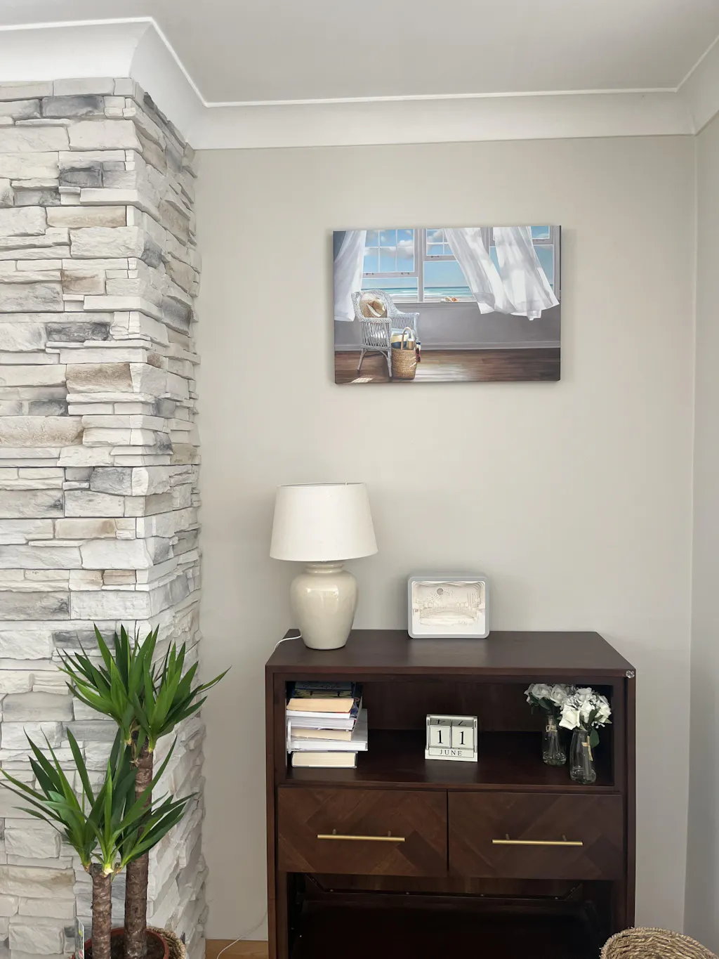
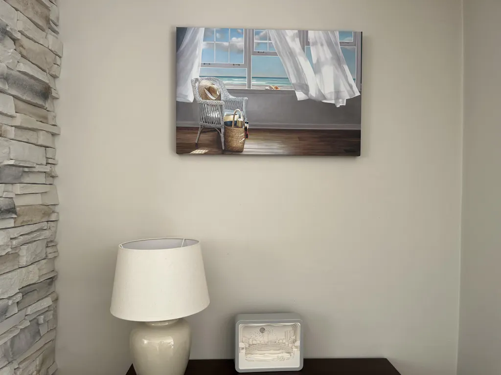
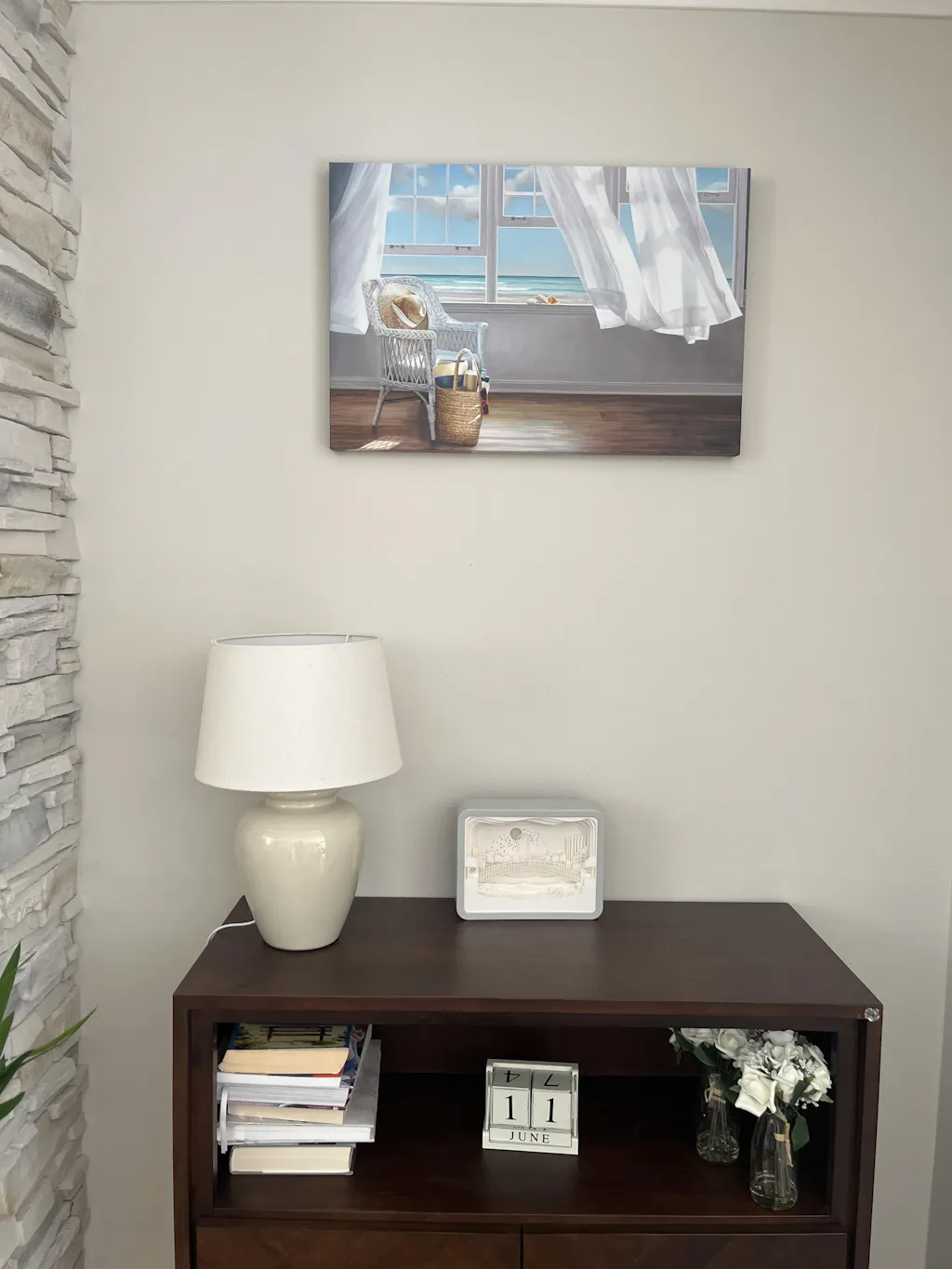
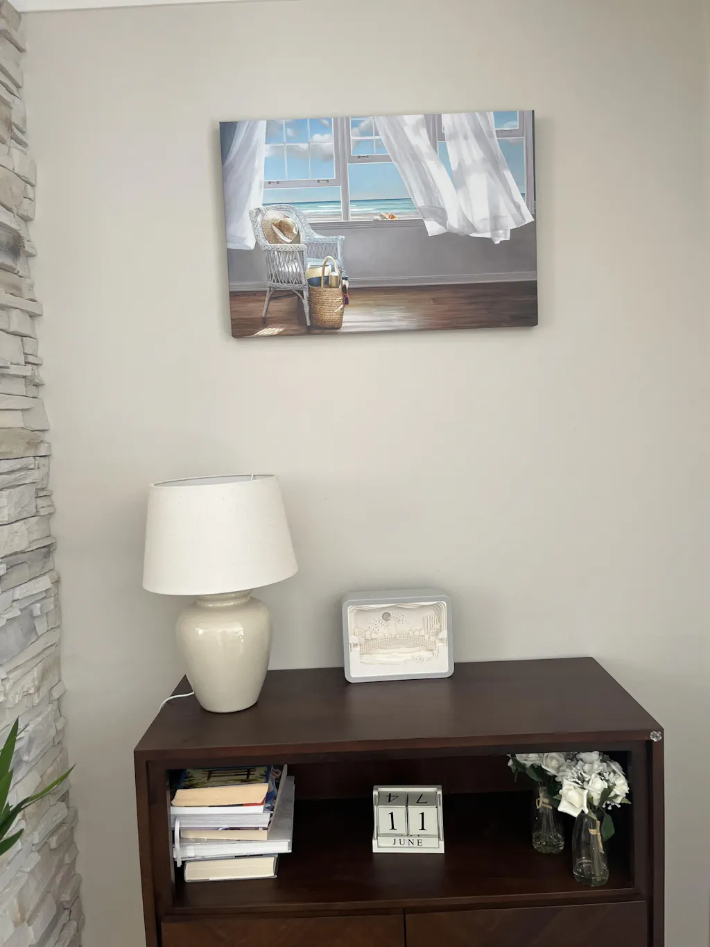
One oversized work can do more than a dozen small ones. It quiets a room, establishes hierarchy, and gives the eye a place to land the moment you walk in. This is the system I use when the architecture is already strong and the wall needs confidence, not complication.
Industry forecasts from Fortune Business Insights project the global wall art market will grow from USD 66.89 billion in 2025 to USD 145.49 billion by 2034, with demand tied to personalized home décor, digital art innovation, and online purchasing platforms that make large-format options more accessible through Fortune Business Insights' wall art market analysis. That accessibility matters because statement art only works when you can source the right scale.

Where this system works best
Minimal interiors, executive offices, hotel lobbies, and dining rooms with long uninterrupted walls all benefit from a single dominant piece. It's especially effective above a low sofa or sideboard where furniture can act as a visual base.
The key trade-off is pressure. A statement piece has to earn its size. Weak composition, muddy color, or flimsy print quality becomes obvious when enlarged.
- Choose distance-friendly art: Strong shapes and a clear focal structure hold up from across the room.
- Hang to human sightlines: Centering the piece around 60 to 66 inches from the floor usually feels right in residential and commercial settings.
- Reduce nearby clutter: Don't crowd the art with busy sconces, shelves, or competing accessories.
- Pick the right surface: Matte textured paper often looks more refined than glossy stock in well-lit spaces.
A large abstract over a sofa in beige, charcoal, or deep olive tones can carry an entire living room. In a boardroom, oversized scenic photography often lands better than something overly decorative because it feels deliberate, calm, and less trend-driven.
3. Color-Blocked Accent Walls
A room with a strong paint color can look flat fast. Art fixes that by giving the wall a second layer of tone, texture, and scale. The result should feel composed, with the wall color, artwork, and frame all working as one design system rather than three separate decisions.
This approach works best when the paint already does part of the visual heavy lifting. Deep olive, clay, slate blue, dusty rose, and warm neutrals all hold art well because they give the piece a defined field. If the wall color is weak or inconsistent across the room, color blocking tends to look accidental.
Build the palette before you choose the piece
Start with one dominant color and decide whether the art should stay inside that family or interrupt it. Tonal schemes feel calm and refined. Contrast schemes feel sharper and more architectural.
The trade-off is clarity. Too much tonal similarity and the art disappears. Too much contrast and the wall starts to read like a showroom display instead of a finished room.
- Use color filters early: They cut the search down to pieces that can live with your paint.
- Choose one relationship: Go tonal with lighter and darker versions of the wall color, or choose one contrasting accent and repeat it once elsewhere in the room.
- Keep the frame disciplined: Black, oak, and matte painted frames usually hold a color-blocked scheme together better than shiny metallic finishes.
- Sample under real lighting: North light, warm lamps, and cool LEDs all change how pigment reads against the wall.
- Watch the surrounding materials: Upholstery, rugs, and drapery should support the palette, not introduce three more competing colors.
Material matters here. Matte paper, canvas, and lightly textured finishes usually sit better on painted walls because they absorb light instead of throwing glare back into the room. If you want more surface detail around the artwork itself, architectural backing can help. A guide to wall panel designs is useful if you are pairing art with battens, molding, or paneled feature walls.
Sizing is what makes the system feel intentional. On a painted block behind a bed, console, or sofa, the artwork should usually fill about 60 to 75 percent of the furniture width. If you are using a rectangular painted zone as a backdrop, leave enough margin around the piece so the color block still reads clearly. In practice, that usually means the paint field needs to be larger than the art by at least several inches on all sides.
A soft green bedroom can carry botanical or abstract work in stone, moss, and ink tones for a restrained look. In an office or retail setting with pale walls, one rust, cobalt, or saffron piece against a controlled color block often gives better definition than filling the wall with smaller accents. Artist collections and platform color filters make this easier to execute because you can sort by palette first, then compare formats and frame finishes without rebuilding the scheme from scratch.
4. Thematic Art Collections & Series
Some walls need narrative, not just decoration. A thematic collection gives a room continuity, especially in long spaces like hallways, stair landings, hotel corridors, and open-plan living areas where one image can feel isolated.
This system works because people don't only buy art as filler anymore. Buyers, particularly millennials and Gen X consumers, are increasingly choosing statement works and investment pieces over smaller decorative items, with market growth projected to reach $118.79 billion by 2032 at a 5.7% CAGR according to the projection referenced in this wall art trend video. In practice, that means collections with a clear point of view are easier to place and easier to remember.
Themes that actually hold a wall
Botanical studies, architectural photography, coastal scenes, travel imagery, and recurring abstract motifs all work because they're broad enough to sustain multiple pieces without becoming repetitive. The mistake is forcing a theme that's too literal, like “all Paris art” or “only blue flowers,” unless the room itself is highly stylized.
A better approach is to choose a visual language. Think line-heavy black-and-white architecture, warm Mediterranean facades, or layered botanical forms across different artists.
- Use artist pages and collections: They help you find bodies of work that already share a visual vocabulary.
- Vary scale within the series: Too many same-size prints can feel retail, not curated.
- Unify with framing: One finish can tie together art from several artists.
- Build a mood board first: It's the fastest way to see whether your theme has range.
For readers planning bigger architectural upgrades, a guide to wall panel designs can help you coordinate art placement with trim, molding, and wall divisions.
A wellness studio might use a sequence of botanical works in muted greens and earth tones. A travel-inspired residential hallway could mix doors, street scenes, and facades from different cities, all unified by warm neutrals and similar framing.
5. Black & White Monochromatic Installations
Black and white art is one of the safest ways to go large without making the room feel overdesigned. It gives you contrast, structure, and sophistication while leaving room for upholstery, rugs, wood tones, and lighting to do their job.
This system is especially useful in transitional homes and commercial settings where the rest of the scheme already carries color. It also solves a common problem. If you're sourcing art for a client who can't commit to a strong palette, monochrome keeps the project moving.
How to stop monochrome from looking flat
The answer is tonal range and material contrast. You need deep blacks, mid-tones, and clean highlights. Then you need presentation choices that add warmth or dimension, such as textured paper, soft white mats, black oak frames, or brushed brass accents nearby.
Black and white succeeds when it feels layered. It fails when it feels like office stock photography.
Try mixing image types rather than repeating one style. A strong monochrome wall often combines a photographic piece, a gestural abstract, and a line-based work so the eye stays engaged.
- Mix media within the palette: Photography, illustration, and abstract pieces can coexist if the tonal balance is strong.
- Warm up the room elsewhere: Walnut, linen, leather, and aged metal keep monochrome from feeling cold.
- Use grayscale strategically: Not every piece needs hard contrast. Softer works create breathing room.
- Let mats do some work: Matting creates quiet separation and can make modest pieces feel more substantial.
This is a favorite approach for entry halls, libraries, and Scandinavian-inspired living rooms. It also performs well in boutique hospitality spaces where the design needs to feel elevated without overwhelming guests.
6. Canvas Triptychs & Multi-Panel Arrangements
A triptych is ideal when one oversized rectangle feels too heavy, but a gallery wall feels too busy. It gives you continuity across a wide span while preserving negative space between panels. That spacing is what keeps the installation architectural.
Use this approach above long credenzas, sectionals, beds, and dining benches. It also works in hospitality settings where you want a panoramic effect without one extremely large framed piece.

What makes multi-panel art look intentional
The image has to survive division. Strong horizons, repeated forms, and flowing compositions work better than busy scenes with one tiny focal point. Canvas is often the best medium here because it keeps the whole arrangement lighter and less visually fussy than heavy framing.
Spacing matters almost as much as the art. Keep the gaps consistent, usually in the 2 to 4 inch range, and align the tops precisely. Even slight inconsistency reads amateur immediately.
- Choose art with lateral movement: Scenic views, abstract sweeps, and geometric compositions divide well.
- Measure from the centerline: Don't place each panel independently. Build from the middle outward.
- Use wall color as part of the design: The negative space between panels is visible, so it needs to support the work.
- Simplify installation: Ready-to-hang canvas options reduce friction on large jobs.
For planning layouts and scale relationships, this guide to 3-piece wall art is a useful reference.
A mountain scene in three canvases above a dining sideboard creates width without clutter. In a contemporary office, a four-panel geometric arrangement can feel sharper and more branded than a traditional framed print set.
7. Oversized Photography & Nature Prints
A large wall can make a beautiful photograph look timid fast. The fix is not just choosing a bigger image. It is building the whole setup as a system: subject, crop, orientation, material, and finish all need to support the room.
Nature photography works best at scale when the image has structure. Fog, rock strata, water movement, tree lines, and horizon bands all hold up across long viewing distances. Busy scenic shots with too many focal points tend to flatten out once enlarged, especially in rooms with layered furniture and patterned textiles. If the goal is calm, choose imagery with one clear visual rhythm.
Build the piece around the wall, not the other way around
Start with wall shape first. A wide sofa wall calls for a horizontal composition with enough visual weight to span the seating below. A stair landing, narrow dining wall, or entry recess usually benefits from a vertical crop that pulls the eye upward. Square formats are useful when the architecture is awkward and neither direction feels resolved.
Using platform filters saves time. Use orientation, color, and artist collection filters early so you are not forcing a portrait image onto a panoramic wall, or vice versa. On photography-driven schemes, that early edit makes the difference between art that feels placed and art that feels improvised.
Material choice matters just as much. Matte paper or lightly textured fine art paper usually gives nature imagery more depth in living rooms, offices, and hospitality settings because it controls glare and keeps the print from reading like commercial decor. Acrylic can sharpen detail beautifully, but in bright rooms it also reflects everything. Canvas softens the image and works well for relaxed spaces, though it is less precise for highly detailed photography.
- Choose images with visual mass: Atmospheric coastlines, close-cropped botanicals, stone textures, and quiet desert scenes generally scale better than postcard views.
- Size with the furniture in mind: The piece should relate to the width of the bed, sofa, console, or fireplace below it, not just the empty wall.
- Keep the frame restrained: Thin black, oak, or natural wood gives photography definition without competing with the image.
- Plan lighting early: Darker forest scenes, dusk images, and monochrome nature prints need direct picture lighting or strong ambient light to stay legible.
- Shop by photographer, not only by subject: Strong artist portfolios usually produce a more consistent result than mixed search pages.
If you are working with a single large photograph, this guide for decorating with oversized art is useful for getting the scale right before you order.
A spa lounge can carry a mist-heavy shoreline or reed study that lowers visual noise. In a residential living room, a glacier detail or dramatic mountain photograph can anchor the space, provided the surrounding furniture stays edited and the palette does not compete.
8. Custom Artist Collaborations & Limited Editions
When a room needs distinction, collaboration beats convenience. Limited editions and artist-led selections bring a layer of authorship that mass-market decorative art can't replicate. In residential projects, that often shows up as a stronger emotional connection. In hospitality or branded commercial spaces, it becomes part of the story guests remember.
Printano's catalog includes more than 9,000 artworks across over 1,000 artists, with artist pages, featured programs, and multiple formats that make browsing by individual creative voice much easier than searching by generic subject. That structure matters because collaboration starts with finding artists whose work already has consistency.
Where exclusivity helps most
Design firms often need artwork that doesn't look easily replaceable. Boutique hotels want local relevance or a distinctive lobby moment. Collectors and homeowners may want a piece that feels less expected than a trend-driven print everyone has already seen.
The trade-off is time. Strong artist-led sourcing usually takes more patience than buying by room color alone. But the result tends to feel more grounded.
A room becomes more persuasive when the art has a maker, not just a SKU.
- Study the artist's wider portfolio: One good image isn't enough. You want consistency across the body of work.
- Read the statement if available: It helps you understand whether the work can support a client narrative.
- Track featured programs: Artist spotlights and weekly highlights are useful when you want fresh work without endless browsing.
- Document the provenance story: In commercial settings, the backstory often matters almost as much as the object.
A boutique hotel lobby with pieces from a local or regional artist immediately feels more specific. A residential office with a limited-edition abstract or photograph can also shift the room from “decorated” to “collected.”
9. Geometric & Abstract Statement Art
A large wall often needs art that sets the room's pace before anything else goes in. Geometric and abstract pieces do that well. They create structure, movement, and color direction without tying the room to a literal subject, which makes them easier to live with as upholstery, rugs, and lighting change over time.
Treat this category as a design system, not a style label. First choose the role the piece needs to play. A geometric work with strong lines can discipline a loose room and sharpen a modern interior. A painterly abstract can soften rigid architecture, break up long wall planes, and give a space more atmosphere.

How to choose abstract art that lasts
Start with scale and composition. Over a sofa, the piece should usually cover enough width to feel intentional, but still leave visible wall around it. On a tall, narrow wall, look for vertical compositions that carry the eye upward instead of forcing a wide format into the wrong footprint. If the composition feels unresolved at thumbnail size, it rarely gets better at full scale.
Then assess energy level. Busy, high-contrast geometry adds tension and focus, which suits offices, entry halls, and rooms with clean-lined furniture. Layered abstracts with softer edges work better where you want visual depth without pressure, such as bedrooms, reading rooms, and relaxed living spaces.
Material and framing matter more here than many people expect. Canvas gives broad, gestural work a quieter presence and reduces glare. Framed paper prints feel sharper and more architectural, especially for line-driven or grid-based compositions. If the room needs warmth, natural wood frames for abstract and geometric prints can keep bold work from feeling cold.
- Leave real margin around the piece: Strong abstract work needs open wall space to read clearly.
- Use platform filters with intent: Sort by color family, orientation, and style so you can build around the room's palette and wall shape instead of scrolling aimlessly.
- Check artist collections, not single images: Repeating visual language across a collection helps when one statement piece may later expand into a pair or series.
- Balance hard art with tactile finishes: Wool, linen, plaster, and wood stop geometric work from feeling too severe.
- Preview frame and size options together: A great image can lose authority if the outer dimensions are too small for the wall.
For a more targeted browse, abstract wall art prints can help narrow the field.
A tech office often suits a crisp geometric composition with black or oak framing and disciplined furniture spacing. A living room with curved seating and warmer woods usually benefits from a looser abstract in a larger format, where the art carries presence without making the room feel rigid.
10. Framed Print Collections with Mixed Matting
Matting is one of the most underestimated tools in wall styling. It changes perceived scale, sharpens the artwork, and lets a collection feel more custom without changing the art itself. If you want a wall to look curated and layered, mixed matting is one of the best systems available.
This approach works particularly well in libraries, studies, showrooms, and transitional homes where craftsmanship matters. It also helps bridge different artwork styles by giving everything a common presentation language.
What to vary and what to keep controlled
Vary the mat width, not everything at once. Or vary the mat tone while keeping frames consistent. Problems start when frame finish, mat color, artwork style, and spacing all shift at the same time.
A common successful formula is one frame family with two mat tones, such as soft white and warm stone. Another is two related wood finishes with mostly neutral mats and one darker accent mat for contrast.
- Use mats to create presence: Smaller prints can hold a larger wall when mats are generous.
- Coordinate with the wall color: White mats on white walls can disappear unless the frame has enough contrast.
- Match the mood of the art: Delicate work usually wants lighter mats. Bolder pieces can handle charcoal or deeper neutrals.
- Preview combinations before ordering: Mixed matting is easiest to get right when you compare options side by side.
Natural wood often gives these installations warmth and flexibility, especially if you're mixing photography, sketches, and abstract prints. For frame direction, natural wood frames are a practical place to start.
A study wall with botanical prints in varied mat widths feels collected and calm. A hallway with line drawings and black-and-white photography can take more contrast, using dark frames and a tighter mat palette for a cleaner gallery effect.
Top 10 Large Wall Art Ideas Comparison
| Style | 🔄 Implementation Complexity | ⚡ Resource & Time Requirements | ⭐ Expected Quality/Impact | 📊 Ideal Use Cases | 💡 Key Advantages / Tips |
|---|---|---|---|---|---|
| Gallery Wall Collections | High, complex layout planning and multiple hang points | Multiple prints/frames, higher total cost, installation time‑intensive | High, dramatic, personalized focal point ⭐⭐⭐⭐ | Large residential walls, boutique hotels, lobbies | Mix orientations, limit to 2–3 frame finishes, use 2–3" spacing |
| Museum-Quality Statement Pieces | Moderate, simpler layout but requires careful handling and pro hanging for large formats | Single oversized premium print, significant cost, specialized shipping/installation | Very high, commanding, museum-grade impact ⭐⭐⭐⭐⭐ | Minimalist interiors, executive offices, high-end lobbies | Center at 60–66" height, choose strong composition, use pro install |
| Color-Blocked Accent Walls | Low–Moderate, selection driven by color matching; may require repainting | Low–medium materials cost; time varies if repaint required | High, strong chromatic cohesion and designer intent ⭐⭐⭐⭐ | Retail, boutique hotels, nurseries, modern offices | Use Shop by Color, test Pantone matches, mix tints/shades |
| Thematic Art Collections & Series | Moderate–High, requires curation and thematic consistency | Medium, sourcing series may need coordination or waitlists | High, cohesive narrative and curated sophistication ⭐⭐⭐⭐ | Museums, corporate narratives, wellness centers, showrooms | Build mood boards, mix artists within theme, vary sizes |
| Black & White Monochromatic Installations | Low, straightforward selection focused on tonality and composition | Low–medium, versatile prints, modest framing needs | Solid, timeless, flexible across palettes ⭐⭐⭐ | Corporate offices, Scandinavian interiors, galleries | Vary contrast and mediums, add warm accents to avoid coldness |
| Canvas Triptychs & Multi-Panel Arrangements | High, precise alignment and spacing critical for cohesion | Medium, multiple panels lower than one giant print but installation complex | High, immersive texture and flow across wall ⭐⭐⭐⭐ | Feature walls, spaces with architectural breaks, lobbies | Keep 2–4" spacing, use ready‑to‑hang panels, measure precisely |
| Oversized Photography & Nature Prints | Moderate, needs adequate wall, lighting, and viewing distance planning | High, large-format photographic reproduction, careful shipping and lighting | High, immersive biophilic and calming impact ⭐⭐⭐⭐ | Wellness centers, spas, living rooms, hospitality properties | Prioritize unique perspectives, use matte textured paper, ensure good lighting |
| Custom Artist Collaborations & Limited Editions | High, coordination, lead times and bespoke arrangements | High, limited runs, higher price, potential waitlists | Very high, unique, collectible, narrative value ⭐⭐⭐⭐⭐ | Collectors, boutique hotels, branded commercial spaces | Document artist story, preorder, maintain artist relationships |
| Geometric & Abstract Statement Art | Low–Moderate, selection depends on scale and composition needs | Medium, single or series options, moderate cost | High, modern, interpretive focal point ⭐⭐⭐⭐ | Modern homes, tech offices, showrooms, mid‑century spaces | Balance intensity with neutral surroundings, consider emotional energy |
| Framed Print Collections with Mixed Matting | High, requires framing expertise and coordinated mat/frame choices | High, premium framing increases cost and lead time | Very high, gallery-quality presentation and protection ⭐⭐⭐⭐ | Galleries, designer showrooms, libraries, high-end residential | Limit finishes to 2–3, vary mat widths for rhythm, preview combinations |
Your Wall, Your Masterpiece
Large wall art works best when you stop thinking of it as a finishing touch and start treating it as part of the room's structure. The wall isn't just empty space to fill. It's a surface that sets proportion, mood, and visual hierarchy. Once you see it that way, your choices get sharper.
Some rooms need a single statement piece. Some need the layered rhythm of a gallery wall. Some benefit from a thematic series, a triptych, or a monochrome arrangement that keeps the architecture calm. The right answer depends on the wall shape, the furniture below it, the light in the room, and how much visual energy you want the space to carry every day.
A few practical principles hold across all ten approaches. Scale first. If the art is too small, no frame or styling trick will rescue it. Material second. Matte and textured finishes often look more refined in lived-in spaces because they control glare and add depth. Color third. The strongest rooms don't always match exactly, but they do look intentional. And presentation is often underestimated. Frame finish, matting, spacing, and placement can make the difference between “nice print” and “finished room.”
If you're decorating as a renter or working around installation limits, even placement style matters. Guidance on leaning wall art from Artfully Walls notes that artwork should be at least 24 inches tall to feel balanced and stable when leaned, and thinner frames may need museum putty for grip. Flat backs and deeper sides also improve stability. That's the kind of detail that keeps a stylish choice from becoming a risky one.
The strongest large wall art ideas aren't random. They come from a system. Choose the wall. Decide the feeling. Determine whether the room needs one voice or several. Then use the filters and artist collections available to narrow the field quickly and keep the result coherent. Printano is one option that supports that workflow with browsing by color, orientation, collection, and artist, along with multiple materials and framing choices.
A blank wall can make a room feel unfinished for months. One decisive art plan can change it in an afternoon.
If you're ready to turn a blank wall into a focal point, explore Printano for framed prints, canvas options, textured paper, artist collections, and color-based browsing that make large wall art easier to source with intention.