
You're probably looking at at least one office wall right now that feels unfinished. The furniture may be in place, the lighting may be decent, and the layout may function, but the room still reads as temporary, generic, or visually flat. That's usually where office wall art stops being a decorative afterthought and starts becoming a design decision.
Well-chosen wall art can change how a workspace feels to employees, clients, and anyone walking in for the first time. One business decor guide even argues that the right office decor ideas can increase productivity by up to 37%, and it places inspiring wall art alongside natural light and plants as part of a stronger workspace strategy. That aligns with what works in practice. Art sets tone, controls visual intensity, and helps an office feel intentional instead of improvised.
This guide keeps the focus on execution. You'll get office wall art ideas that work in modern workplaces, plus the trade-offs, placement logic, and material choices that make the difference between polished and distracting. If you're also refining surfaces, finishes, and paint direction, this roundup of fresh ideas for interior walls is a useful companion.
Table of Contents
- 1. Abstract Geometric Art
- 2. Inspirational Typography and Motivational Quotes
- 3. Nature and Landscape Photography
- 4. Company Branding and Custom Logo Art
- 5. Minimalist Line Art and Sketches
- 6. Color Blocking and Bold Monochromatic Designs
- 7. Industrial and Urban Photography
- 8. Data Visualization and Infographic Art
- 9. Botanical and Plant Illustrations
- 10. Personal Photography and Company Culture Documentation
- Office Wall Art: 10-Item Comparison
- Curate Your Office, Inspire Your Work
1. Abstract Geometric Art

Abstract geometric art is one of the safest modern office wall art ideas because it adds structure without demanding emotional attention. Sharp lines, repeated forms, and controlled color fields look professional in reception areas, meeting rooms, and focused work zones. They also age better than trend-led graphic prints.
In practice, this style works especially well for tech firms, consulting spaces, design studios, and any office that wants a current look without leaning casual. A client-facing conference room often benefits from geometry because it signals order and intention. A loud figurative piece can dominate the room. Geometry usually supports the room instead.
Why it works in offices
The strongest versions use a limited palette and clear composition. That matters when you're sourcing through a broad catalog. Printano's color filtering is useful here because it lets you narrow artwork to tones that already exist in flooring, upholstery, joinery, or brand accents.
Practical rule: If the furniture already carries texture or pattern, keep the art composition simple. If the furniture is minimal, the artwork can do more visual work.
Features, pros, and watch-outs
- Best feature: Geometric art bridges creative and corporate environments without feeling out of place in either.
- Main advantage: It creates interest while staying open-ended, so teams don't tire of it quickly.
- Main risk: Too many high-contrast pieces on one wall can make the room feel busy and fragmented.
A real-world example is the wall above a desk run or credenza. Instead of one generic poster, use a square framed print with restrained color blocking, or build a tidy triptych with matching margins and frame finishes. In such applications, framed formats usually outperform unframed paper. They install faster and look resolved on day one.
2. Inspirational Typography and Motivational Quotes
Typography can work in an office, but only when it feels editorial or architectural. Most quote art fails because it's either too obvious, too sentimental, or too visually loud for daily use. The best pieces don't shout. They reinforce tone.
Reception areas, breakout spaces, corridors, and internal social areas are better locations than formal boardrooms. In those high-traffic zones, a concise phrase, a company value rendered with strong spacing, or a typographic composition with a minimalist backdrop can act as a visual cue without becoming workplace wallpaper.
Where typography succeeds and where it fails
Typography succeeds when the phrase is short, the font is intentional, and the layout has breathing room. It fails when designers try to cram messaging, branding, and decoration into one piece. If a wall reads like a slide deck, people stop seeing it.
A good real-world application is a coworking lounge where teams need energy but not visual chaos. Another is a staff kitchen where a restrained typographic piece can soften a purely functional wall. Printano's premium textured paper is especially effective for this category because the material gives simple letterforms more presence.
Best-use guidelines
- Keep the wording brief: A few words hold attention better than a long statement.
- Match tone to room type: Neutral typography suits executive and client-facing spaces. More expressive color can work in creative studios.
- Rotate selectively: If your messaging changes seasonally or culturally, change a small portion of the display rather than replacing everything.
“The best quote art behaves like signage with personality, not like a speech on the wall.”
This category pairs well with geometric backgrounds, muted gradients, or subtle texture. On its own, it can feel thin. Paired well, it becomes one of the more flexible office wall art ideas for culture-led spaces.
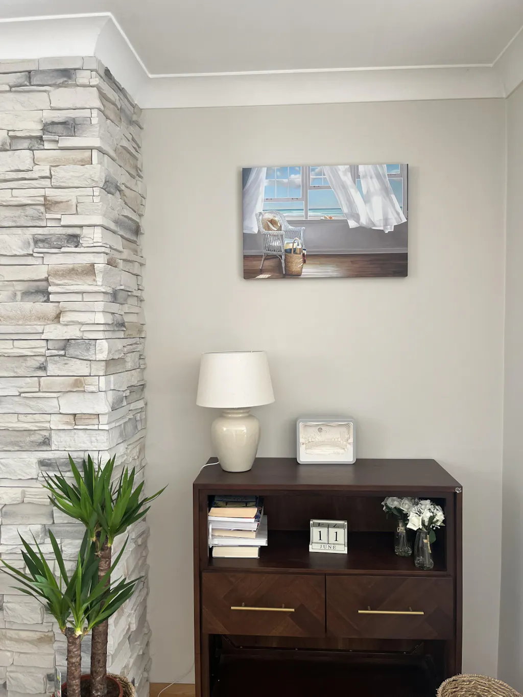
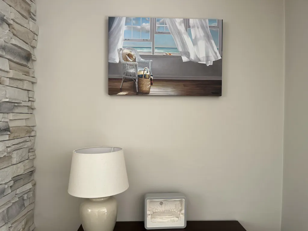
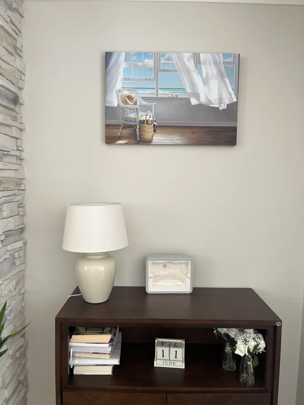
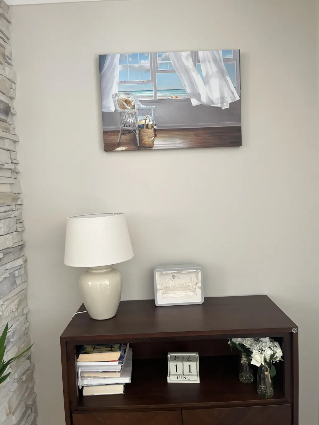
3. Nature and Landscape Photography

A team steps out of a tense meeting, passes a corridor lined with harsh white walls, and heads straight into more screen time. The room does nothing to reset their focus. Well-chosen nature photography solves that problem by giving the eye a visual pause and the office a quieter emotional baseline.
This category performs best in private offices, waiting rooms, wellness areas, and high-pressure departments where people need calm without visual boredom. It also travels well across sectors. Legal firms, clinics, consultancies, and home offices can all use outdoor imagery without it feeling trend-driven or overly personal.
What makes this category work
The strongest pieces share three traits. They have a restrained palette, a clear focal point, and enough negative space to read from a distance. Forest edges, water, stone, cloud cover, and wide-open terrain usually work better than busy travel-style photography with too many competing details.
Scale matters just as much as subject matter. As noted earlier, artwork generally looks right when it relates proportionally to the furniture below it. In practice, I usually specify one larger piece over a desk, sofa, or credenza instead of a scattered set of small frames, especially in offices that already have visual clutter from monitors, cables, and paperwork.
If you want a cleaner version of this aesthetic, Printano's guide to simple and elegant interiors with a minimalist wall decor approach is a useful reference point.
Pros, trade-offs, and best fits
Best features
- Creates a calmer atmosphere without reading as decorative filler
- Works across traditional, modern, and hybrid office styles
- Pairs easily with wood, stone, glass, and neutral upholstery
Pros
- Reduces the visual hardness of screen-heavy spaces
- Gives client-facing rooms a more considered, welcoming tone
- Holds up well over time because the subject matter is broad and flexible
Cons
- Generic stock imagery can make the office feel impersonal
- Overly dramatic sunsets or hyper-saturated scenes often look dated fast
- Weak printing materials flatten subtle detail, which hurts this category more than bolder graphic styles
Execution details that improve the result
- Use one dominant piece where people pause: Behind seating, near a meeting table, or at the end of a corridor, a larger print usually has more impact than a gallery cluster.
- Filter by palette first: Blues, greens, greys, and soft earth tones are easier to integrate with existing finishes. Printano's color filtering is useful here because it helps teams narrow options by mood, not just subject.
- Choose premium materials for subtle imagery: Nature photography depends on tonal variation and depth. Textured paper or higher-end print finishes help mist, water, and foliage read with more nuance.
- Match intensity to room purpose: Quiet scenes suit focus rooms and executive offices. Brighter coastal or desert images can work in break rooms where the goal is mental reset.
A strong real-world application is a break room with hard flooring, acoustic panels, and limited daylight. One large print of water or tree cover on premium stock can soften the space quickly and make the room feel intentional rather than purely functional.
This category also pairs well with living plants, timber finishes, and muted textiles. Used carefully, it supports productivity because the room feels less strained and more balanced.
4. Company Branding and Custom Logo Art
Brand art belongs in offices, but it needs editing. Most branded walls go wrong because they use oversized logos with no design intelligence behind them. That makes the office feel promotional rather than polished.
The better approach is to treat branding as source material. Pull from your mark, color system, icons, packaging patterns, or timeline milestones, then translate those elements into actual art. A stylized logo composition in reception can work. A history wall in a corridor can work. A repeated logo on every available wall won't.
Branding that feels designed, not promotional
This category is strongest in reception, executive zones, conference suites, and visitor circulation paths. It tells clients they're in a coherent environment, and it gives employees a visual connection to the brand they represent. Printano's color-led browsing helps here because brand alignment often comes down to hitting the right tonal family, not reproducing every corporate color exactly.
The global wall art market itself is substantial enough to support more systematic sourcing. Fortune Business Insights values it at USD 66.89 billion in 2025 and projects USD 145.49 billion by 2034, with a 9.39% CAGR over 2026 to 2034. For office buyers, that matters because wall art is no longer a niche finishing touch. It's a mature category that supports repeatable specification across sites.
What to include
- Logo reinterpretations: Use scale, layering, crop, or abstraction to make the mark feel graphic rather than corporate.
- Brand timeline moments: Founding year visuals, product evolution, or major campaigns can work as curated art walls.
- Client-facing restraint: Keep branded pieces cleaner and quieter than internal celebration walls.
A practical example is a consultancy reception with one large framed brand-derived abstract piece, then smaller supporting works in adjacent meeting rooms that echo the same palette. The space feels branded without feeling like a trade show booth.
5. Minimalist Line Art and Sketches

Minimalist line art is often underestimated because it doesn't announce itself. That's exactly why it works. In offices where focus matters, restraint is an asset.
This style is especially effective in architecture studios, consulting spaces, private offices, and any room with clean joinery, pale walls, and controlled materials. It can also rescue spaces that already have strong finishes. If the flooring, ceiling grid, or glazing makes a room feel busy, line art restores visual calm.
Where minimalism earns its place
The success of line art depends on proportion and framing. Thin lines disappear if the print is too small or the frame is too weak. Go larger than you think, especially on walls viewed from a distance, and use white, black, or natural wood frames that support the drawing rather than competing with it.
Printano's editorial guide on decorating with wall decor for a minimalist approach is helpful if you're shaping an entire simple-and-elegant interior language rather than choosing a single piece.
Practical styling moves
- Use negative space intentionally: A minimalist print needs margin around it.
- Pair delicate art with warm materials: Wood, boucle, wool, or matte painted finishes prevent the room from feeling clinical.
- Group with discipline: A small series works well if frame size, spacing, and subject style stay consistent.
Minimalist art doesn't fill a wall. It tunes it.
A good real-world use case is a partner office or interview room where you want sophistication without distraction. Botanical line drawings, contour figures, or architectural sketches all work, provided they're printed with enough scale and contrast to remain legible across the room.
6. Color Blocking and Bold Monochromatic Designs
Not every office needs calming art. Some need energy, contrast, and a clearer sense of creative confidence. That's where color blocking and bold monochromatic pieces come in.
These works are strong in ideation rooms, collaborative zones, creative agencies, and startup environments where momentum matters. A bold field of cobalt, rust, ochre, or green can animate a wall faster than a detailed scene. It also reads cleanly from a distance, which makes it effective in open-plan offices.
When bold color works best
This category performs best when the room itself is fairly controlled. If the carpet pattern is loud, the furniture is multicolored, and the branding is already intense, bold art can tip the room into noise. If the architecture is neutral, these pieces create needed tension.
Printano's trend-led editorial content, including its 2025 Color of the Year feature, can help teams decide whether they want art that blends into an existing palette or deliberately breaks it.
How to keep it controlled
- Use one dominant hue: Multiple competing accent colors usually feel scattered.
- Anchor it with neutrals: Black frames, oak furniture, white walls, or concrete finishes keep the result grounded.
- Place it where collaboration happens: Shared work tables, creative hubs, and social corners can handle more visual energy than focus booths.
A strong example is a brainstorming room with pale walls and simple task seating. One oversized monochromatic print can give the room identity without turning it into a mural project. Among office wall art ideas, this one has the most immediate visual effect, but it also has the smallest margin for error. Test it against samples, finishes, and light before committing.
7. Industrial and Urban Photography
Urban and industrial photography brings edge, texture, and contemporary relevance into office interiors. Architectural lines, bridges, facades, streetscapes, concrete details, and city skylines all work when you want a sharper visual language.
This category tends to suit agencies, property firms, engineering consultancies, corporate offices with metropolitan branding, and client-facing areas that need authority with a modern slant. Black and white city photography is especially useful because it layers in detail without overwhelming the palette.
Best fit for this style
Urban imagery is strongest when it reflects the kind of environment the business operates in. A real estate advisory might use architectural photography. A design studio might choose more experimental urban compositions. A headquarters in a major city can use local landmarks or anonymous urban geometry to root the space in place.
Trade-offs and placement
- Best advantage: It gives offices a crisp, professional mood with depth and texture.
- Common downside: Too much steel, concrete, and monochrome can make a room feel cold.
- Fix: Pair industrial imagery with warm woods, soft seating, or layered lighting.
A practical example is a boardroom with walnut veneer and dark acoustic panels. A large black and white architectural print on the long wall adds polish without competing with presentations on screen. In a reception area, a cityscape can also act as local storytelling if it reflects the office's region or market.
8. Data Visualization and Infographic Art
Data-driven companies often miss an opportunity on their walls. They either avoid data entirely or turn it into something so technical that nobody wants to look at it. Infographic art solves that when it's handled with design discipline.
Good data visualization art isn't just a report enlarged and framed. It simplifies, abstracts, and prioritizes. The visual should communicate pattern, movement, growth, comparison, or system logic in a way that still feels aesthetic from across the room.
When information becomes art
This style works best in analytics firms, fintech offices, research environments, innovation labs, and conference areas where the company's identity is closely tied to evidence and insight. It can also be effective in internal team zones when the data celebrates a milestone, a product system, or a meaningful operational story.
Europe's wall art market alone is estimated at USD 18.33 billion in 2024 and projected to reach USD 37.28 billion by 2033, with an 8.21% CAGR. For multi-region buyers, that suggests a strong enough market to support more localized assortments, modular formats, and curated specification workflows, which is especially useful when custom data-led graphics need consistent production across offices.
Here's a useful visual reference for thinking about information design in a more creative way:
How to avoid cluttered results
- Edit the message: One strong idea per piece is enough.
- Favor pattern over density: If every label matters, it belongs in a report, not on a wall.
- Update thoughtfully: Replace visuals when the story changes, not just because the calendar does.
Field note: The best data art triggers conversation first and explanation second.
A good real-world example is a product company turning user journey stages or network relationships into a clean, color-coded composition for a strategy room. It says something real about the business, but it still behaves like art.
9. Botanical and Plant Illustrations
Botanical illustration sits in a useful middle ground between decorative and disciplined. It's natural, but more formal than nature photography. It's soft, but still structured. That makes it one of the more versatile office wall art ideas for spaces that need warmth without losing polish.
Traditional specimen studies, watercolor leaves, muted floral forms, and contemporary botanical compositions all work. The key is choosing the right level of detail for the room. Detailed vintage-style studies suit executive offices and hospitality-style lounges. Looser botanical forms can work in break areas and wellness spaces.
Why botanical art remains versatile
This style pairs beautifully with timber, linen, textured paper, stone finishes, and soft neutral palettes. It also complements live plants without replicating them exactly. If an office already uses planters and natural materials, botanical art helps complete that language.
Where it performs best
- Executive offices: It adds refinement without stiffness.
- Break rooms and wellness rooms: It softens functional spaces.
- Reception and waiting areas: It creates a welcoming, settled atmosphere.
A practical example is a healthcare-adjacent office that wants to feel reassuring but not clinical. A series of framed botanical illustrations in muted greens and warm neutrals can make the space feel composed and humane. The main caution is over-detailing the wall. If every print is intricate, the collection can become visually dense. Mix a few hero pieces with quieter supporting works.
10. Personal Photography and Company Culture Documentation
Culture photography can be powerful, but it's the easiest category to mishandle. The difference between meaningful and awkward usually comes down to curation. Not every team photo belongs on a wall.
The best culture-led installations use professional photography, consistent editing, and a clear narrative. Think milestone events, hands-at-work details, environmental portraits, community impact, workspace moments, or historical company images. When handled as a curated series, these pieces humanize the office and build belonging.
Authenticity with boundaries
This approach is strongest in internal social spaces, corridors, collaboration zones, and employee-focused areas. It's less effective when it takes over every client-facing room, because that can make outsiders feel like they've entered a private clubhouse instead of a professional office.
Printano's custom printing and framing options are useful here because culture photography needs consistency. Mixed print quality, ad hoc cropping, and mismatched frames can make even strong images feel disposable.
How to make it feel like art
- Use a unifying treatment: Black and white, one frame finish, or one aspect ratio creates cohesion.
- Curate for story, not attendance: Choose images that reveal culture, not just who was present.
- Get consent and review use rights: Especially in larger organizations, this isn't optional.
A strong real-world example is a nonprofit displaying community project imagery in a staff area, or a multi-generational family business presenting selected archival photographs in a heritage corridor. These installations work best when they sit alongside other art categories, not instead of them. Culture walls should add authenticity, not carry the whole design scheme.
Office Wall Art: 10-Item Comparison
A comparison table is useful only if it helps a team choose faster and install with fewer mistakes. Use this one as a decision tool. Match the art type to the room's function, the brand tone, and the level of upkeep your office can realistically support. Printano's color filtering, custom sizing, and premium material options matter here because the same concept can look sharp in one finish and flat in another.
| Art Type | Implementation Complexity 🔄 | Resource Requirements ⚡ | Expected Outcomes 📊 | Ideal Use Cases 💡 | Key Advantages ⭐ |
|---|---|---|---|---|---|
| Abstract Geometric Art | Medium, requires scale, spacing, and alignment decisions | Moderate, prints, frames, possible multi-panel layouts | Clean contemporary presence; can support creative energy without visual noise | Contemporary offices, meeting rooms, tech startups | Flexible across palettes, scales well, stays current over time ⭐ |
| Inspirational Typography & Quotes | Low to Medium, depends on typographic quality and message restraint | Low, custom text, premium paper or frames | Reinforces values and daily focus; can fade into the background if overused | Receptions, break rooms, team hubs | Direct messaging, easy to personalize, strong brand voice potential ⭐ |
| Nature & Scenery Photography | Low, if image quality and sizing are handled carefully | Moderate, high-resolution prints, textured papers for larger pieces | Softens pressure-heavy spaces; supports focus and visual recovery | Break rooms, high-stress areas, healthcare settings | Calming, widely appealing, easy to pair with neutral interiors ⭐ |
| Company Branding & Custom Logo Art | High, requires disciplined design and accurate color matching | Moderate, designer time, brand files, premium finishes | Builds brand recognition; improves client impression when applied with restraint | Reception, conference rooms, executive suites | Clear identity, cohesive presentation, strong brand reinforcement ⭐ |
| Minimalist Line Art & Sketches | Low, straightforward to curate; placement and lighting still matter | Low, small or large prints, framing, controlled lighting | Quiet visual structure that supports concentration | Minimalist offices, private offices, gallery-style corridors | Timeless, low distraction, refined presentation ⭐ |
| Color Blocking & Bold Monochrome | Medium, requires color testing and awareness of room psychology | Moderate, large saturated prints, material samples recommended | Strong visual energy; can sharpen mood or fatigue a space if overdone | Creative studios, collaborative spaces, accent walls | Fast impact, clear zoning effect, useful for brand-led palettes ⚡ ⭐ |
| Industrial & Urban Photography | Low to Medium, depends on image tone and print treatment | Moderate, high-contrast or black-and-white prints, framing | Adds edge and structure; can feel cold if used too heavily | Tech firms, design agencies, client-facing areas | Strong architectural interest, works well in monochrome, contemporary feel ⭐ |
| Data Visualization & Infographic Art | High, requires clean design, accurate data, and planned updates | High, designer time, data sourcing, periodic refreshes | Signals analytical culture; loses value if data becomes dated | Conference rooms, analytics teams, finance offices | Informative, discussion-starting, highly customizable ⭐ |
| Botanical & Plant Illustrations | Low, with thoughtful style and scale selection | Moderate, detailed prints, quality paper, lighting that preserves detail | Supports biophilic design and adds warmth without clutter | Wellness areas, executive offices, hospitality-style workspaces | Natural character, calming effect, polished decorative value ⭐ |
| Personal Photography & Culture Documentation | Medium, requires image selection, permissions, and consistent production | Moderate, photographer, editing, custom printing | Builds belonging and credibility; needs periodic review to stay relevant | Break rooms, employee areas, internal corridors | Authentic, cost-effective if assets already exist, high internal resonance ⭐ |
The trade-offs are straightforward. Typography and line art are easier to execute on a modest budget, but they rely heavily on design discipline. Branding pieces and data-based art carry more strategic value, yet they demand tighter production control. Nature and botanical categories are safer choices for broad appeal, while color blocking and urban photography make a stronger statement and need more restraint.
If a team is stuck between two directions, start with the room goal first. Choose calming categories for recovery and focus zones, identity-led categories for reception and leadership spaces, and higher-energy categories for collaboration areas. Then use Printano's material and color controls to narrow the final selection so the work fits the office instead of competing with it.
Curate Your Office, Inspire Your Work
A client walks into the office for the first time, scans the room, and forms an opinion before the meeting starts. Staff do the same thing every day, though less overtly. Bare walls read as unfinished, while poorly chosen art creates visual noise that drags on concentration and weakens the overall standard of the space.
The best office wall art ideas solve a functional problem as well as an aesthetic one. Abstract geometric prints create structure and momentum. Scenery photography softens demanding environments. Branding pieces reinforce identity when they are handled with restraint. Minimalist line art supports focus. Color blocking energizes creative zones. Urban scenery adds edge. Botanical illustration brings warmth. Data visualization reflects analytical culture. Company photography adds authenticity when it is edited and presented with care.
Category choice matters, but execution decides whether the result looks credible. Scale has to relate to the wall and furniture. Color has to work with flooring, upholstery, and lighting. Frames and paper stock have to match the level of polish the business wants to project. One of the most reliable rules is still the two-thirds approach above desks and credenzas, because it prevents art from looking timid or oversized. Rotation also deserves more attention than it usually gets. As noted earlier, keeping a larger pool of approved prints and swapping selections seasonally is a practical way to keep an office current without starting over each quarter.
That is where a structured selection process helps. Instead of choosing pieces one by one, build the scheme around room function, palette, material, and replacement cycle. A reception wall needs confidence and clarity. A focus room benefits from quieter compositions and tighter color control. A break area can absorb more personality, texture, and contrast.
Procurement has changed too. Office art is now easier to specify as part of a repeatable design system rather than a one-time decorative purchase. That matters for companies fitting out multiple rooms or multiple sites, because consistency depends on having reliable options for format, orientation, framing, and finish.
If you are planning a refresh, start with the wall that carries the most visual weight. Usually that is the reception backdrop, the wall behind a desk, a conference room focal point, or a staff area that feels flat. Set the room goal first, then choose art that supports that goal. After that, use material quality and framing to control the final impression. If digitally generated visuals are part of the concept phase, this guide to professional AI images offers a useful reference point.
The office does not need more decoration. It needs clearer signals, stronger visual rhythm, and art that earns its place.
Printano makes that process easier. With Printano, teams can source museum-quality wall decor from a large artist catalog, filter by color and orientation, choose framed or unframed formats, and build office-ready schemes that feel curated instead of pieced together. That combination is especially useful when a project needs both creative range and practical control. Designers, workplace teams, and business owners can move from idea to specification faster, with better consistency across rooms and a cleaner final result.