
You've finished the hard part. The cabinets are in, the lighting works, the counters are clear, and the kitchen finally functions. But it still feels a little flat. That's the point where art changes the room. It softens all the hard surfaces, gives the eye somewhere to land, and makes a practical space feel lived in.
Good art for kitchen walls isn't just about finding something pretty with lemons on it. A kitchen is humid, busy, often awkwardly laid out, and full of visual interruptions. Art has to earn its place there. It needs to suit the style of the room, survive the environment, and fit those narrow strips of wall that seem impossible to decorate.
That's also why kitchen art has lasted. It has roots in the still-life tradition, which became a major independent genre in Europe during the 17th century. In the American Wing of the Metropolitan Museum of Art, women make up 23% of the artists in still-life paintings according to this Metropolitan Museum discussion. Kitchens have always been visually rich spaces. Food, vessels, flowers, and everyday objects naturally translate into art.
If you're refreshing the whole room, it can help to pair artwork decisions with small surface changes. These DIY tips for kitchen updates are useful if you want to rethink walls, cabinets, or splash areas at the same time.
For a less literal route, I often point people toward subjects that bring in warmth without shouting “theme decor,” like animal wall art with a softer decorative feel.

Table of Contents
- Bringing Your Kitchen's Personality to Life
- Finding Your Kitchen's Style and Palette
- Choosing Materials That Withstand the Heat
- The Art of Placement Scale and Lighting
- Creative Ideas Beyond Fruit Bowls
- Your Buying and Care Checklist
Bringing Your Kitchen's Personality to Life
A kitchen without art often feels finished but not resolved. You notice it most in the quiet moments. Morning coffee, late-night cleanup, a glance across the room and nothing holds the space together. Art fixes that by adding rhythm, contrast, and some evidence that a person lives there.
The mistake is treating kitchen art like an afterthought. In a working kitchen, every object competes for attention. Appliances, handles, stools, open shelves, extractor hoods. The art has to bring calm, not more noise. That usually means choosing pieces that support the mood of the room instead of repeating every obvious kitchen motif.
Practical rule: Pick art that reflects how the room feels when you want to be in it. Relaxed, graphic, playful, minimal, rustic, collected. That mood matters more than whether the subject is food-related.
Still-life gives this category a useful foundation because it connects domestic life with art history, but that doesn't mean your own kitchen needs to look traditional. A contemporary abstract can do the same job if it echoes the room's materials. A botanical print can warm up sleek cabinetry. A vintage-style poster can cut through a plain white wall and make the room feel settled.
What works best is art that responds to the room's reality. A small galley kitchen needs a different approach than an airy kitchen-diner. A rental with tile everywhere needs a different strategy than a custom home with open plaster walls. Once you stop decorating by theme and start decorating by conditions, choices become much easier.
Finding Your Kitchen's Style and Palette
A kitchen usually shows its style before you hang a single piece. The job is to read the fixed surfaces first, then choose art that brings order to them.

Read the room before you shop
Start with what cannot easily change. Cabinets, handles, counters, backsplash, floor tone, and pendants do most of the styling work in a kitchen. Art should respond to those elements, especially in a room full of reflective and hard-wearing finishes.
I use a quick visual check with clients. If the cabinetry is sharp and minimal, the art usually needs the same discipline. If the joinery is softer or more traditional, the art can carry more warmth, texture, or nostalgia without feeling out of place.
- Flat-front cabinets + minimal hardware suit abstract art, architectural prints, restrained photography, or monochrome line work.
- Shaker cabinets + warmer finishes pair well with botanicals, vintage-inspired prints, scenic studies, and softer palettes.
- Mixed finishes + open shelving can handle layered pieces with a collected feel, as long as the composition stays controlled.
If you are still refining the room itself, The Cabinet Coach's guide to cabinet colors is a useful reference. Cabinet color sets the tone for everything nearby, including the art.
The clearest rule is simple. Art should either support the cabinetry or intentionally balance it. In a kitchen with strong green, navy, or black cabinets, quieter artwork often does more good than another statement piece. In a pale kitchen with little contrast, art can carry more visual weight.
A broader style filter also helps. If your kitchen feels spare, calm, and edited, minimalist wall decor ideas for simple and elegant interiors will help you spot pieces that belong and reject ones that only looked good in isolation.
Build a palette that works with hard finishes
Kitchen palettes behave differently from living room palettes. Tile reflects light. Stone has undertones. Stainless steel, black fixtures, timber stools, and painted cabinetry all push color in different directions. Art has to connect those materials instead of competing with them.
Three palette approaches work well:
| Approach | How it works | Best for |
|---|---|---|
| Echo | Pull one or two colors already in the room | Calm kitchens that need cohesion |
| Contrast | Add a missing color that still relates to the finishes | Neutral kitchens that feel flat |
| Bridge | Tie together two finishes that currently feel separate | Kitchens with mixed metals or wood tones |
A bridge palette is often the most useful in real kitchens. If you have cool grey counters and warm oak stools, look for art that contains both temperatures, such as muted green, soft brown, stone, or off-white. If the room is mostly white and timber, a piece with charcoal, rust, olive, or deep blue can give the space some backbone.
Orientation matters as much as color. Kitchens rarely offer one large, blank wall. You are usually working around pantry doors, windows, shelves, radiators, tile returns, or the narrow strip beside a fridge housing. That is why Printano's color and orientation filters are practical. They make it easier to find a vertical piece for a tight wall or a wide format for the space above a breakfast bench without forcing a style mismatch.
Good kitchen art looks considered, but it also solves a problem. The right piece can soften a run of cabinetry, connect mixed finishes, and make an awkward wall feel intentional.
Choosing Materials That Withstand the Heat
A kitchen is rough on art. Steam drifts upward. Grease settles slowly. Cleaning sprays hang in the air. Even if you never fry anything dramatic, the room still exposes wall decor to more stress than a hallway or bedroom.
That's why material choice matters as much as the image itself.

What works in a real kitchen
Unprotected paper near moisture is usually a weak choice. It can ripple over time, especially close to sinks, kettles, or poorly ventilated cook zones. Open canvas can also be tricky in hard-working kitchens because textured surfaces can hold dust and grease.
Protected formats tend to be easier to live with. Framed prints with acrylic glazing create a barrier between the image and the room. Smooth-surface formats are also simpler to wipe down than anything porous or heavily textured.
Here's the trade-off in plain terms:
- Open canvas feels relaxed and painterly, but it isn't ideal near grease or steam.
- Framed prints with protective glazing suit most kitchens because the front surface is easier to maintain.
- More wipeable hard-surface options can make sense in busy family kitchens or hospitality settings where practicality comes first.
Quick material comparison
| Material type | What it does well | What to watch for |
|---|---|---|
| Canvas print | Softens modern kitchens, less reflective | Harder to clean if exposed |
| Framed print with acrylic front | Good protection from splashes and airborne grime | Can catch glare if lit badly |
| Unframed paper print | Casual and affordable for lower-risk zones | Needs distance from steam and splash areas |
| Tile or hard-surface art piece | Suits heavy-use areas and wipes clean easily | Can feel more decorative than art-led |
Put your most delicate piece in the safest location, not your favorite location.
Frame style matters too. In kitchens, bulky mouldings can collect grime in corners and creases. Slim profiles are usually easier to maintain and look sharper against tile, cabinetry, and stone. If you like a little depth without too much visual heaviness, floating frame prints are worth considering because they create definition without the thick look that can crowd a compact wall.
The best test is simple. Ask whether you'd feel comfortable cleaning around the piece every week. If the answer is no, it probably belongs in the dining area instead of the kitchen itself.
The Art of Placement Scale and Lighting
Bad placement makes good art look accidental. Kitchens are unforgiving in that way because cabinets, shelves, and appliances create strong horizontal and vertical lines. If the art ignores those lines, the room feels off immediately.

Use the wall you actually have
Most kitchens don't offer one large blank wall. They offer fragments. The strip beside a tall cabinet. The section above a breakfast nook. The gap between a doorway and a shelf. That changes how scale works.
A few placement decisions solve most problems:
- Narrow wall section: use a vertical print or a stacked pair.
- Space above a bench or sideboard: use a wider horizontal piece.
- Awkward interrupted wall: build a compact grouping instead of forcing one oversized frame.
- Transition from kitchen to dining area: go slightly larger so the art can connect both zones visually.
If you like grouped arrangements, 3-piece wall art layouts can work especially well in breakfast areas and transitional walls because they spread visual weight without requiring one dominant statement piece.
Height spacing and visual balance
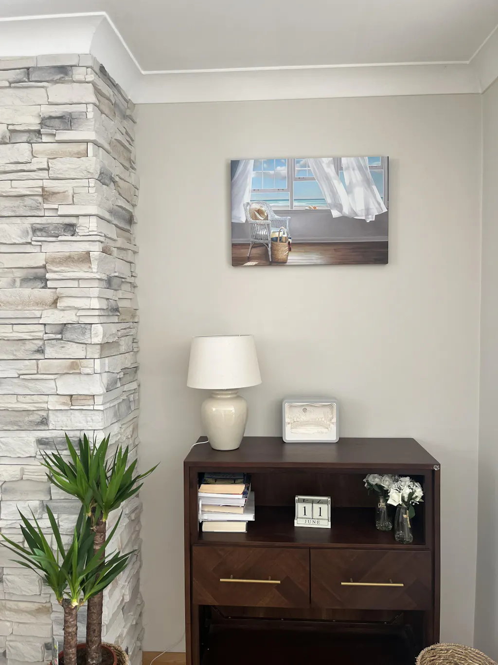
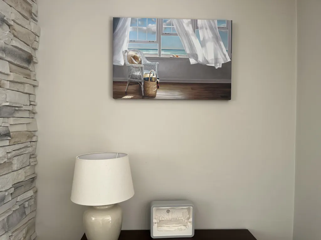
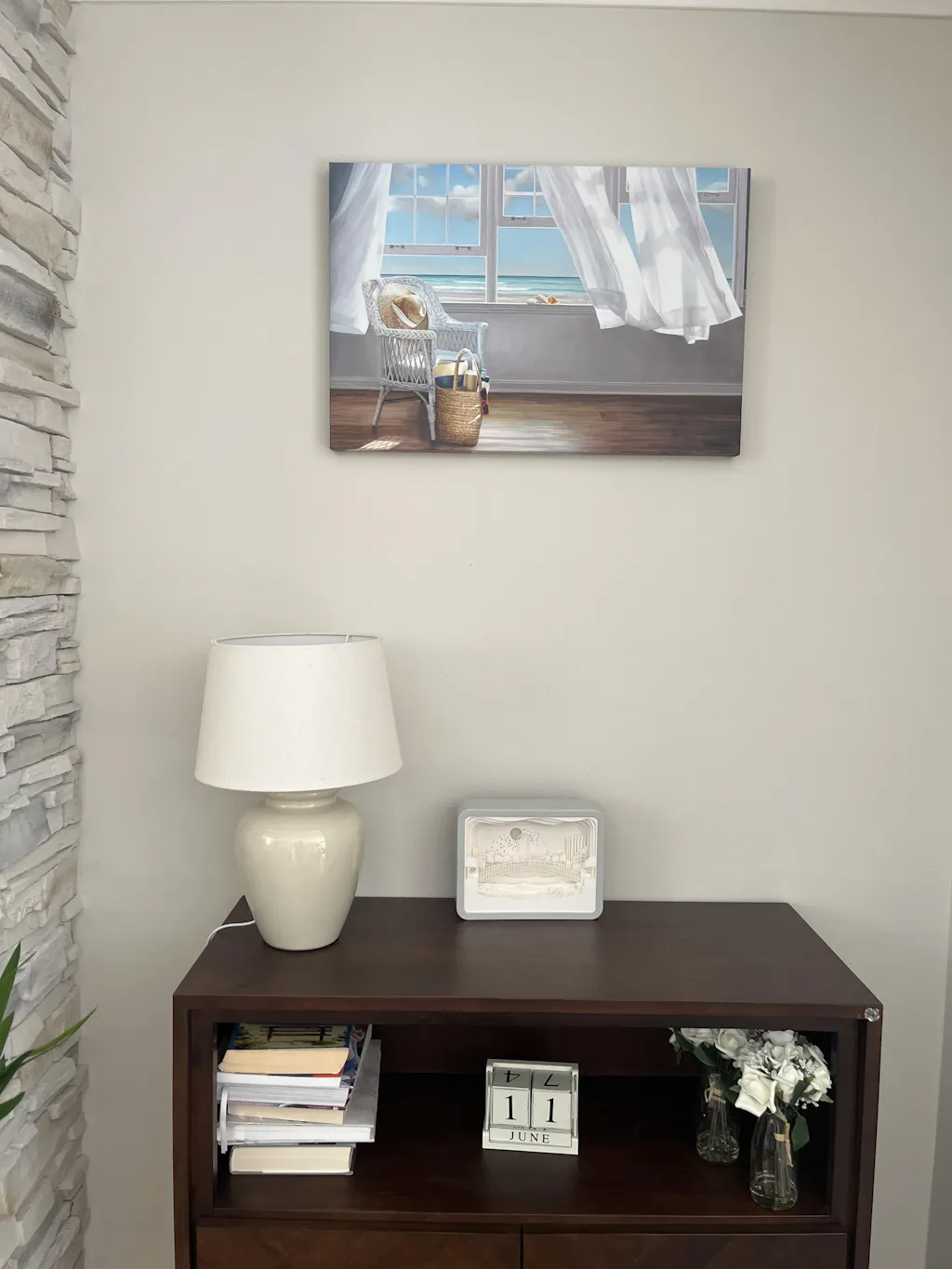
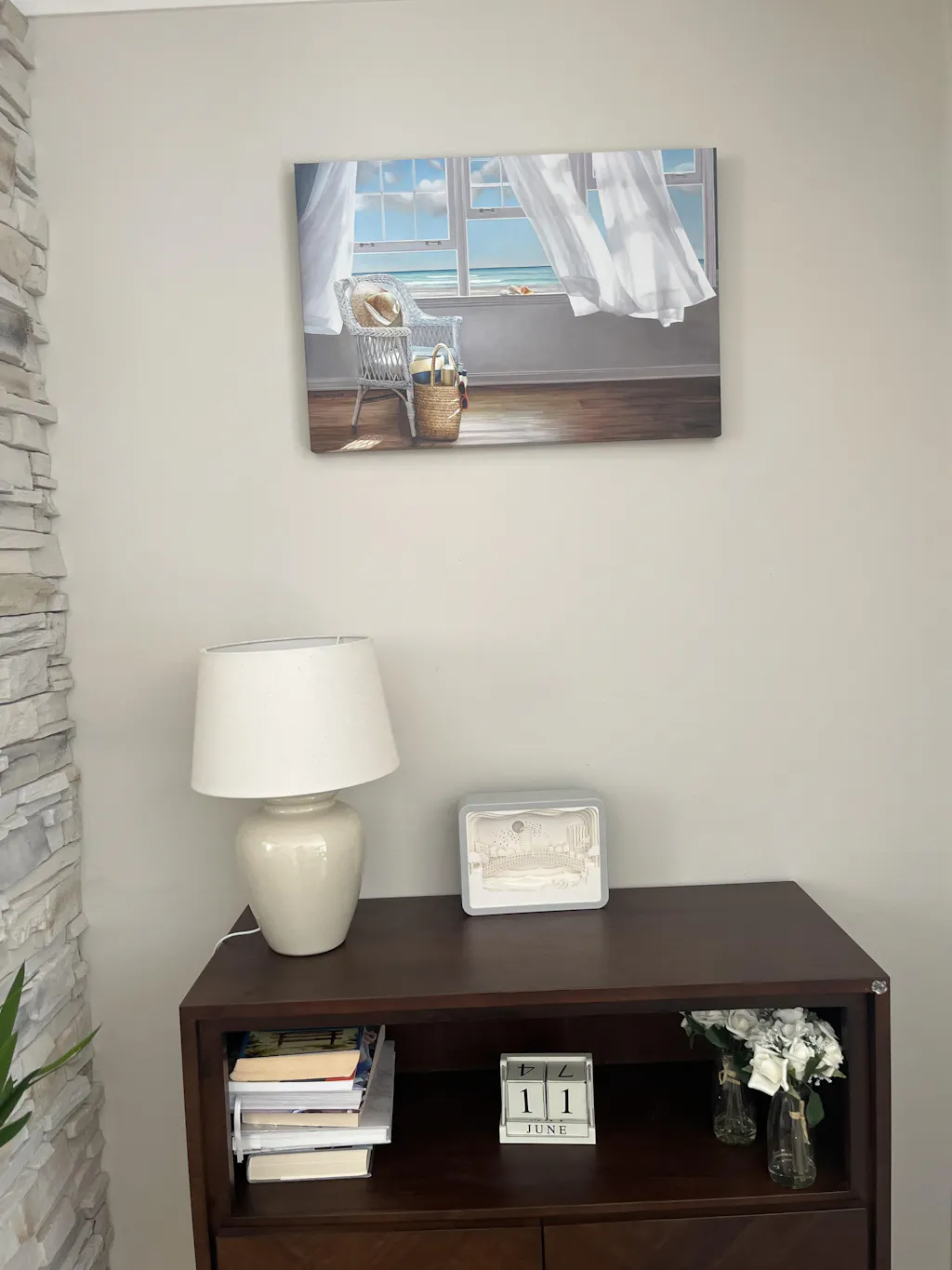
For kitchens, the strongest hanging method is to place the artwork's center at about 145 to 150 cm above the floor, and if you're building a gallery wall, keep 5 to 8 cm between frames and test the arrangement on the floor first, as recommended in this kitchen wall art hanging guide.
That guidance matters because kitchens have tighter sightlines than living rooms. You're often seeing the piece while standing at the sink, entering from a hallway, or sitting at a nearby table. A small alignment error becomes very obvious.
A quick planning sequence works well:
- Measure the visible wall area between cabinets, shelves, doors, and switches.
- Mark the visual center of the available zone, not just the entire wall.
- Lay the arrangement on the floor first or mock it up with paper.
- Check distances from steam and splash points before you commit.
- Repeat one unifying element such as frame finish, palette, or subject tone.
A gallery wall only looks relaxed when the spacing is disciplined.
Light the art without fighting the kitchen
Kitchen lighting often misses wall art completely. Downlights create harsh top glare. Under-cabinet strips can make the lower wall bright while leaving art in shadow. Pendant lights may add drama over an island but nothing to a nearby print.
The fix isn't always adding a picture light. Sometimes it's choosing art that works with the existing light. Matte finishes tend to read more softly in bright kitchens. Dark moody work can disappear on an underlit wall. Highly reflective glazing can become annoying opposite a window or polished splashback.
Check the art at the times you use the room. Morning and evening light can change everything. If a piece only looks good at noon, it isn't right for that spot.
Creative Ideas Beyond Fruit Bowls
Food art can work. It's just not the only language available, and often not the most interesting one. The strongest kitchens usually feel personal rather than themed.
Subjects that feel collected not clichéd
A few alternatives consistently work well:
- Abstracts that borrow the room's colors. These are useful when you want cohesion without literal references to cooking.
- Nature scenes or seascapes. They can visually open a compact kitchen and soften hard architectural edges.
- Architectural prints or line drawings. Good in modern kitchens with clean cabinetry and restrained materials.
- Botanicals with a quieter palette. Better than loud novelty herb prints when you want something calmer.
- Found ephemera or family pieces. Menus, postcards, handwritten recipes, or small personal photographs can make the room feel grounded.
A kitchen is also a social space, so art doesn't need to be culinary to belong there. It just needs to feel convincing in a room where people gather, move, and notice details at close range.
What to do when there is barely any wall space
Most guides often falter. They assume every kitchen has generous blank walls, which many don't. In compact kitchens or near risky zones, the workaround matters more than the ideal.
Recent editorial advice on kitchen art points to practical alternatives such as taping unframed prints to cabinet doors, resting smaller pieces on shelves or tile backsplashes, or shifting the artwork focus into adjacent dining nooks in kitchens where open wall space is limited or too exposed to splashes and heat, as noted in this discussion of kitchen art workarounds.
That idea opens up better options than forcing art above a sink or beside a cooktop. Sometimes the smartest move is to place one strong oversized piece just outside the kitchen proper, where it still shapes the experience of the room. If you like that approach, decorating with oversized art is useful inspiration for dining transitions, breakfast corners, and open-plan layouts.
What doesn't work is filling every spare inch with cute themed pieces. Kitchens already contain enough objects. Art should edit the room, not clutter it.
Your Buying and Care Checklist
A good kitchen art purchase holds up under real use. Steam, cooking residue, glare, tight clearances, and constant movement will expose a weak choice fast, even if the image looked perfect on your phone.
I use a final check before ordering because kitchens punish guesswork more than living rooms or bedrooms.
Before you order
Run through these points:
- Measure the true hanging area. Account for switches, outlet plates, under-cabinet lighting, shelf depth, and any door or drawer swing that cuts into the visual space.
- Choose the orientation for the gap, not just the artwork. Tall narrow walls need vertical pieces. Short runs above a breakfast station usually take a horizontal format better. Square works best when the surrounding elements already create balance.
- Match the finish to the zone. Framed prints behind glass or acrylic are easier to wipe down near prep areas. Canvas works better in lower-splash spots where you want a softer, less reflective surface.
- Check the wall against the rest of the room. If the backsplash already carries strong pattern, color variation, or handmade texture, quieter art usually reads better. If you are still selecting that surface, these stunning tile backsplash designs help clarify how much visual weight the wall will already have.
- Look at frame depth and profile. Slim, simple frames tend to suit kitchens because they collect less grime and sit more comfortably beside cabinetry, tile, and hardware.
One more practical point matters online. Product filters save time. Printano offers a large range of artworks from many artists, with multiple sizes and orientations, plus free worldwide shipping and a 30-day return policy. That makes it easier to compare options for awkward kitchen gaps without committing too early.
After it arrives
Care should be easy enough that you will do it.
- Dust or wipe the surface gently with a soft dry cloth, or a lightly damp one if the finish allows it.
- Keep delicate pieces out of direct splash paths near sinks, kettles, and heavy prep zones.
- Use your extractor fan consistently while cooking, especially when frying or boiling for long stretches.
- Watch the piece for the first few weeks. Evening glare, heat exposure, and visual crowding usually show up quickly in a working kitchen.
The right piece should still look considered after a busy month, not just on installation day.
A kitchen rarely needs a lot of art. It needs art that fits the wall, survives the room, and stays easy to live with. If you are comparing options by size, orientation, and finish, browse Printano for pieces that work in compact gaps, dining transitions, and full kitchen walls.