
You've found a print you love. The colors work with your room, the subject feels right, and you can already see it above the sofa or in the hallway. Then the practical question shows up. Should you leave it unframed, put it in a standard frame, or choose something that looks more polished without feeling heavy?
That's where floating frame prints often make sense. They give artwork a finished, architectural look that feels intentional on the wall. The effect is clean, modern, and easy to live with, but it can also be confusing when you're ordering online. Terms like reveal, depth, and substrate don't always help if you are trying to decide what will look good in your home.
This guide is for that exact moment. If you want your art to look refined but you also want to feel sure before you buy, the sections below will help you understand what floating frames are, why they look different, and how to choose one that suits your space. If you enjoy learning through real decorating examples, the Printano blog is also a useful place to keep gathering ideas.
Table of Contents
- What Are Floating Frame Prints
- How Floating Frames Create a Unique Look
- Floating Frames vs Traditional Frames
- How to Choose the Perfect Floating Frame
- Hanging and Caring for Your New Artwork
- Finding Your Floating Frame Print at Printano
What Are Floating Frame Prints
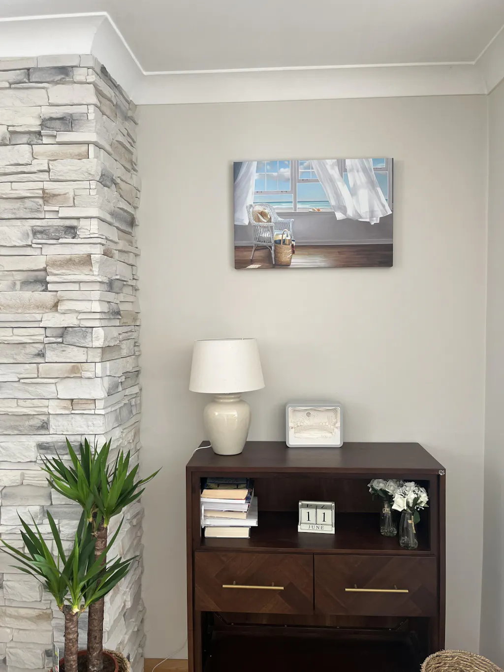
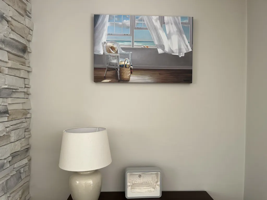
A floating frame print is a piece of wall art displayed so the artwork appears to sit inside the frame rather than being pressed tightly against it. That small visual separation changes the whole mood of the piece. Instead of looking enclosed, the art feels presented.
A simple example helps. Say you buy a canvas artwork for a dining room. Unframed, it can look relaxed and casual. In a traditional frame, it can look more formal or classic. In a floating frame, it often lands in the middle. It feels refined, but not stiff. You still notice the artwork first, yet the frame gives it a finished edge.
Floating frames became important because they solved a practical display problem. Sources on floater frame history describe the format as a mid-20th-century innovation developed so the full artwork could be shown without covering the edges behind a frame lip, creating the suspended look people now associate with gallery presentation, as noted in this history of floater frames.
Why people choose them
Readers usually get confused here because the phrase “floating frame prints” sounds technical. The idea is very visual.
- You see the full art more clearly: The frame doesn't crowd the image.
- The piece gains depth: A narrow space around the artwork creates a subtle shadow.
- The wall display looks more intentional: The frame acts almost like a finishing line around the piece.
Floating frames work well when you want your art to look collected and considered, not just hung.
For many homeowners, that's the main appeal. You're not only buying a print. You're choosing how that print will live in the room every day.
How Floating Frames Create a Unique Look
The easiest way to understand the look is to think of the frame as a small stage for the artwork. A traditional frame wraps around the edge and overlaps part of the piece. A floating frame gives the artwork breathing room, so your eye reads the art and frame as two distinct layers.

The reveal is what creates the effect
The key detail is the reveal, meaning the visible gap between the edge of the artwork and the inside edge of the frame. One professional guide describes a typical reveal of 1/4 inch, while another notes 1/8 inch, and that small gap is what creates the floating illusion and shadow line in finished presentation, according to Bay Photo's explanation of float frames and traditional frames.
That gap matters more than most shoppers expect. Without it, the art would merely look framed. With it, the piece feels lifted, almost as if it's hovering inside the outer border.
Why it feels so modern
The look isn't modern just because it's minimal. It's modern because it changes the role of the frame. Instead of hiding edges and closing the work in, the frame supports the art while keeping the full perimeter visible. That makes the presentation feel lighter.
This is especially effective in rooms with simple furniture, textured fabrics, and clean lines. In a neutral living room, for example, a floating frame can make an abstract print feel crisp and architectural. In a home office, it can make photography feel more deliberate and less decorative. If you're styling a workspace and want to see how wall art changes the mood of a room, these office wall art ideas are a useful reference point.
Three visual details your eye notices
- The shadow line: The gap creates a neat line of shadow around the art, which adds depth.
- The edge visibility: The sides of the piece remain part of the design instead of disappearing under a frame lip.
- The separation of elements: Artwork and frame feel connected, but not fused together.
Practical rule: If a frame makes the art feel trapped, it's probably too visually heavy for the piece.
That's why floating frames often suit contemporary interiors so well. They don't fight for attention. They create structure around the artwork and let the piece carry the room.
Floating Frames vs Traditional Frames
A lot of buyers reach this point with a practical question. The artwork is chosen, the room is taking shape, and now the frame has to do more than look nice in a product photo. It has to make the piece feel right once it is on your wall.

Floating frames and traditional frames create two different viewing experiences. A traditional frame acts more like a border around the art. A floating frame works more like a stage set, giving the artwork a small amount of breathing room so the piece feels more deliberate and more object-like.
Quick side by side view
| Feature | Floating Frame | Traditional Frame |
|---|---|---|
| Aesthetic focus | Highlights depth and separation | Highlights border, finish, and enclosure |
| Artwork exposure | Keeps the full edge visible | Usually covers the outer edge |
| Visual feel | Clean, architectural, gallery-inspired | Classic, polished, sometimes decorative |
| Best fit | Canvas and mounted wall art | Paper art, mats, and conventional displays |
What you actually notice in a room
The difference becomes clear once the piece is hanging. A floating frame tends to make art feel intentional from every angle. You see the full silhouette, the gap around the piece, and the relationship between the artwork and the frame itself. In a modern living room, that often reads as confident and uncluttered.
Traditional framing creates a more contained look. That can be exactly right for art that benefits from matting, ornament, or a sense of history. Outdoor sketches, vintage prints, family portraits, and detailed paper works often suit this approach because the frame helps organize the image and present it with more formality.
Price is part of the decision too. Floating frames often cost more than standard framing options because they use a deeper construction and require more precise spacing for the final presentation. The extra cost usually makes sense when the frame is meant to be part of the visual impact, not just edge protection.
That matters even more with larger pieces. Oversized art needs a frame treatment that looks intentional at scale, which is why these ideas for decorating with oversized art in a way that improves the room are helpful before you buy.
If you are still unsure, sketch the wall before ordering. Tools like Room Sketch 3D for DIY decorators can help you test whether your room wants a crisp floating outline or a more classic framed border.
Choose a floating frame when you want the artwork to feel sharper, more current, and more sculptural. Choose a traditional frame when you want a finished border that adds softness, history, or decoration.
For Printano shoppers, this comparison is useful because it turns taste into a clearer buying decision. If you want the print to feel premium, contemporary, and ready to anchor the room on its own, a floating frame is often the stronger fit.
How to Choose the Perfect Floating Frame
The right floating frame isn't only about color. It's about proportion, material, and how the art will behave in the room. This is the point where many buyers hesitate, because they can picture the general style but aren't sure how to make the final call.
Start with the room, not the frame
Look at the surfaces already in the space. If the room has black metal lighting, dark hardware, or charcoal accents, a black frame often adds crisp definition. If the room uses pale oak, linen, plaster, and soft neutrals, a lighter wood tone may feel more integrated. White can work beautifully in bright interiors where you want the art to blend cleanly into the architecture.
For minimalist homes, restraint usually looks better than contrast for its own sake. If you're styling a calm space with reduced visual noise, these ideas on art for simple and elegant interiors can help you judge when a frame should stand out and when it should support the piece.
Get comfortable with reveal size
Here's the technical part in plain language. The reveal should feel proportional to the artwork. According to Web Picture Frames, 1/4 inch is common for smaller works, while larger pieces often use a reveal of 3/8 to 3/4 inch so the floating illusion still looks balanced in relation to the artwork size, as explained in this floater frame guide.
You don't need to calculate this by eye on your own, but it helps to understand what you're looking for.
- Small artwork: A narrow reveal keeps the frame from overpowering the print.
- Large artwork: A wider reveal gives the image enough visual breathing room.
- Awkward proportion: If the gap feels too tight or too wide, the piece can look accidental rather than refined.
A floating frame should look like it belongs to the artwork from the beginning, not like it was added later to solve a problem.
Match the frame to the print material
This is the overlooked part of the buying decision. Canvas, mounted paper, acrylic, and metal don't present the same way. Each material has different edge behavior, surface character, and depth. That's why floating frames can't be judged only by front view photos.
If you like planning your room visually before you buy, tools such as Room Sketch 3D for DIY decorators can help you test wall placement, nearby furniture scale, and overall balance before you commit.
A simple decision filter
Ask yourself these three questions:
-
Do I want the art to feel modern or classic?
If modern is the goal, floating frames often fit more naturally. -
Will the frame support the colors in the room?
Black creates structure. Wood adds warmth. White keeps things light. -
Am I buying the frame as part of the finished look?
If yes, it's worth choosing a presentation style that feels complete from day one.
When those answers are clear, the purchase gets much easier.
Hanging and Caring for Your New Artwork
Once your artwork arrives, most of the anxiety shifts from choosing to handling. People worry about damaging the frame, hanging it crooked, or placing it in the wrong spot. The good news is that framed artwork is usually simpler to live with than buyers expect.

What to know before you hang it
WHCC notes that professional floating frame systems are built to tight tolerances and offered across substrates such as fine-art paper, acrylic, metal, gallery-wrap, and wood print, with sizes ranging from 5×7 to 30×40 inches in their float frame product specifications. That precision matters because a proper fit helps the artwork keep its clean shadow line and gallery-style finish once it's on the wall.
For placement, keep your approach simple.
- Center for viewing: Hang the piece where it's comfortable to look at while standing or seated nearby.
- Mind the surrounding furniture: Leave enough visual space above consoles, headboards, and sofas so the art doesn't feel crowded.
- Check the wall light: Glare, direct sun, and deep shadows can change how the piece reads.
If you want a more exact method for hook placement and leveling, this Critelli Furniture hanging guide is a practical companion.
Easy care that protects the finish
Floating frames don't need complicated maintenance. In most homes, gentle care is enough.
- Dust lightly: Use a soft microfiber cloth on the frame surface.
- Skip harsh sprays: Strong cleaners can affect finishes and leave residue.
- Avoid direct sunlight: Too much sun can alter how artwork looks over time.
- Handle from the sides: When repositioning, support the piece carefully instead of grabbing one corner.
For grouping framed works, spacing matters as much as cleaning. If you're building a multi-piece arrangement, these ideas on decorating with sets of framed art can help you make the arrangement feel coherent instead of scattered.
Clean presentation lasts longer when the artwork is placed thoughtfully and touched as little as possible.
That's often the whole maintenance plan. Careful hanging, a stable location, and occasional dusting go a long way.
Finding Your Floating Frame Print at Printano
You find a print you love online. Then the practical questions start. Will the floating frame feel crisp or heavy in your room, will the size suit the wall, and will the finished piece look as refined in person as it does on your screen?
That is the true buying decision with framed art. You are not only choosing an image. You are choosing how that image will live in the room, how much visual presence it carries, and whether the frame treatment gives it the gallery-like finish you want.

A good online shopping process should make those decisions clearer, not harder. The strongest product pages show the artwork as a finished object, not just a flat image. You want to understand the relationship between the print and the frame, how much breathing room the floating presentation creates, and whether the final look reads warm, minimal, dramatic, or soft. That visual context is what helps you buy with confidence instead of guessing.
A simple way to choose is to work from room to artwork, not the other way around. Start with the mood of the space. A quiet bedroom often suits softer palettes and calmer compositions. A dining room or office can carry stronger contrast and bolder scale. Once that part is clear, the other filters begin to make sense.
Use this order:
- Start with color family: This keeps the print connected to the finishes, textiles, and paint tones already in the room.
- Choose orientation next: Vertical pieces suit narrower wall sections, while horizontal and square formats usually feel more settled over furniture.
- Set the scale: Ask whether the artwork should anchor the wall or play a supporting role among other objects.
- Refine with the frame: At this stage, the floating frame becomes the finishing touch that sharpens the presentation.
This method works because each choice answers a different design question. Color answers harmony. Orientation answers fit. Size answers presence. The frame answers polish.
Printano supports that kind of decision-making with browsing by color, category, collection, size, and orientation across a wide artist catalog. For a buyer, that matters because it bridges the gap between aesthetic taste and an actual purchase. You move from "I like this print" to "I know why this version will work in my home."
The practical side matters too. Free worldwide shipping, integrated tracking, and a 30-day return policy make the purchase feel more considered and less risky, whether you are choosing one statement piece for a living room or specifying artwork for a work space.
If you want a floating frame print that feels intentional once it is on the wall, explore Printano and narrow your options by color, orientation, size, and framing style until the right piece matches both your eye and your room.