
You're probably standing in front of a wall that feels unfinished. The furniture is simple. The palette is calm. You've avoided clutter. But now the room risks going in one of two directions. It either feels blank and unresolved, or so careful that it starts to look flat.
That's where Japandi style wall art matters. It isn't just decoration. In a room built on restraint, the art often does the quiet work of adding warmth, rhythm, and depth without breaking the calm. The challenge is knowing how to choose a piece that honors negative space, instead of making the wall feel empty.
Table of Contents
- Understanding the Essence of Japandi Style
- Key Characteristics of Japandi Wall Art
- How to Select and Place Japandi Wall Art
- Japandi Wall Decor Mood Board Ideas
- Choosing the Right Print and Frame for Japandi Style
- How to Find Japandi Art on Printano
Understanding the Essence of Japandi Style
Japandi is a design trend defined by the fusion of Japanese wabi-sabi and Scandinavian minimalism. The term combines “Japanese” and “Scandinavian,” and the style is characterized by simplicity, natural elements like sustainable timber, and calm color palettes that create an organic minimalism focused on tranquility, as described by Artfully Walls' overview of Japandi wall art.

What makes that definition useful is the why behind it. Japanese design brings respect for imperfection, quiet materials, and thoughtful emptiness. Scandinavian interiors bring warmth, function, and a sense of ease. Put together, they create rooms that feel edited but not severe.
A lot of people get confused here and assume Japandi means bare walls, pale wood, and almost no personality. It doesn't. It means every object has a purpose, and visual calm matters as much as visual beauty.
Practical rule: If a room feels peaceful but still lived-in, you're getting close to Japandi. If it feels staged or sterile, it needs more texture, softness, or human touch.
Wall art plays a bigger role in this style than many people expect. In a maximalist room, art can compete with patterned textiles, books, and collected objects. In a Japandi room, the artwork often becomes the main visual voice. That's why the piece you choose has to do more than “match.”
A gentle way to build the full atmosphere is to think beyond what you see. Soft lighting, natural materials, and scent all support the mood. If you use an essential oil diffuser in the same room, these diffuser use and maintenance tips are a practical companion to the calm, intentional environment Japandi aims for.
If your taste already leans pared-back, you may also like this guide to art for simple and elegant interiors with a minimalist approach. It helps clarify the difference between minimal and empty, which is exactly where many decorating decisions go wrong.
Key Characteristics of Japandi Wall Art
Japandi wall art has a recognizable visual language. Once you know what to look for, it becomes much easier to tell the difference between a piece that feels authentically calm and one that presents as neutral.

Why the style feels calm instead of cold
The beauty of Japandi art lies in “soft structure and negative space,” with warm tones, clean forms, and a muted palette that can include colors like sky blue and dusty pink against stark whites, according to Bumblejax's guide to Japandi wall art. That description matters because it explains why the look feels composed rather than flat.
The color palette is usually restrained, but not lifeless. Think muted neutrals, earthy shades, soft whites, and occasional dusty color. The room stays quiet, yet the art still gives your eye somewhere to rest.
Motifs tend to fall into a few families:
- Abstract forms that suggest stone, movement, natural scenes, or brushwork
- Minimal line drawings with a human or botanical feel
- Nature references such as leaves, stems, hills, water, or sun shapes
- Textured compositions that mimic linen, plaster, clay, or raw paper
The composition is just as important as the subject. Japandi pieces often use asymmetry well. A shape may sit off-center. A line may feel hand-drawn rather than perfectly geometric. Empty space becomes part of the design.
A simple checklist for spotting the look
When you're evaluating art, ask these questions:
- Does it leave room to breathe? Dense, edge-to-edge designs usually fight the Japandi mood.
- Does it feel organic? Even geometric work should have softness somewhere, in tone, spacing, or texture.
- Does it echo the room's materials? If your room has oak, linen, stone, or ceramic, the art should feel related.
- Does it calm the wall? Good Japandi style wall art adds presence without shouting.
A botanical print can work beautifully here, especially if it avoids busy detail and keeps the palette grounded. This collection of botanical wall art ideas is a helpful reference if you want natural motifs without tipping into cottage or traditional styling.
The easiest mistake is choosing art that is neutral in color but noisy in composition. Japandi needs both restraint and intention.
How to Select and Place Japandi Wall Art
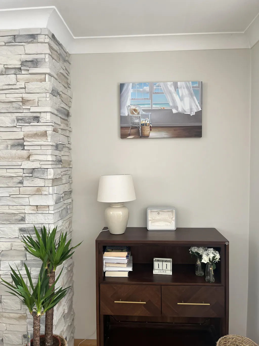
Finding Japandi art appealing is rarely an issue. The struggle is with placing it well. A good piece can still feel awkward if it's too small, too centered, too glossy, or too isolated from the furniture below it.
Start with the wall, not the artwork
Before you choose a print, look at the architectural conditions first. Is the wall wide or narrow? Does it sit above a sofa, bed, console, or stand alone? Does the room get soft daylight or strong direct light?
For Japandi interiors, scale should feel intentional. A tiny frame floating above a wide sofa often reads timid, not minimal. A very large piece on a narrow wall can erase the feeling of breathing room that makes the style work.
A practical rule many designers use is to let the artwork span about two-thirds of the width of the furniture beneath it. That keeps the wall balanced without overcrowding it.
| Wall/Furniture Size | Recommended Art Width | Styling Tip |
|---|---|---|
| Narrow console or small accent chair zone | About two-thirds of the furniture width | Choose a vertical or square piece to keep the arrangement compact |
| Standard sofa wall | About two-thirds of the sofa width | A horizontal piece or a balanced diptych usually feels settled |
| Wide bed wall | About two-thirds of the headboard or bed width | Keep shapes soft and spacing generous for a restful look |
| Tall, narrow wall | Let height do more of the work than width | Use one vertical piece instead of several small frames |
| Large blank wall with no furniture | Use one statement piece or a spaced pair | Leave clear margins around the composition so the wall still feels airy |
If you need help getting the hanging height precise once you've picked your layout, Gorins' guide for hanging art is a practical walkthrough. It's especially useful when a simple arrangement needs to look exact.
Use texture to prevent monotone boredom
A key challenge in Japandi interiors is avoiding monotone boredom. Designers increasingly use wall art with earthy textures or muted tones like sky blue to break up flatness while maintaining serenity, as noted in Laboostudio's discussion of Japandi art.
Many rooms achieve dramatic improvement. If your sofa, rug, and walls are all close in tone, don't solve the problem with a loud accent color. Solve it with materiality. A textured print, a handmade-looking composition, or a subtle tonal shift can add depth without breaking the mood.
A calm room still needs contrast. In Japandi spaces, contrast often comes from texture, shape, and spacing rather than bright color.
Here's a reliable way to choose:
- Match the room's undertone first. Warm beige rooms want warm art. Cooler gray rooms want softer stone and charcoal notes.
- Add one quiet point of difference. This could be visible grain, plaster-like texture, or a muted blue accent.
- Repeat one material cue. If the room has pale wood, choose art or framing that echoes that natural finish.
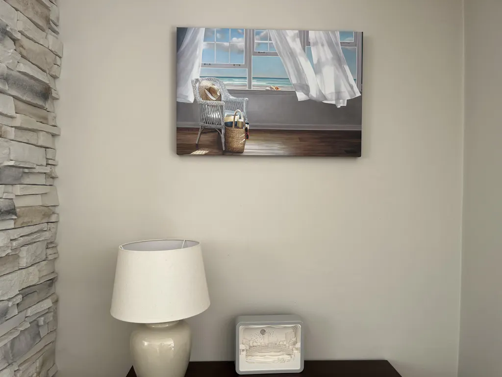
Placement rules that keep walls airy
Placement matters as much as the print itself. In Japandi styling, negative space isn't accidental. It's arranged.
Use these rules as a guide:
- Center over furniture, not always on the wall. If a sofa sits off-center on a long wall, align art with the sofa zone rather than the full wall width.
- Leave visible margins. The emptiness around the piece helps the art feel considered.
- Choose orientation by architecture. Horizontal art calms wide walls. Vertical art lifts narrow ones. Square pieces work well in compact areas or above consoles.
- Keep frame profiles slim. Natural wood and thin black frames usually support the artwork without stealing attention.
- Use pairs carefully. A diptych works when both pieces share tone and visual weight. If the pairing feels busy, one larger piece is usually better.
If you want a second reference for layout basics, this guide on how to hang wall art can help you think through spacing, alignment, and eye-level placement.
Japandi Wall Decor Mood Board Ideas
Sometimes the easiest way to understand Japandi style wall art is to place it in a room and see how it changes the mood. These combinations work because the art supports the architecture instead of trying to dominate it.

The serene sanctuary
Start with soft beige or warm white walls, light oak furniture, linen bedding, and one ceramic vase with a branch or stem. Over the bed, hang a restrained botanical line drawing or a quiet abstract with soft negative space. Natural wood framing keeps the whole arrangement gentle.
This room works because nothing is overexplained. The art doesn't need strong contrast. It needs a calm silhouette and enough presence to stop the wall from disappearing.
A visual walkthrough can help if you want to study the mood in motion:
The modern minimalist
This version uses more contrast. Picture a warm off-white wall, a low-profile sofa, charcoal accents, and a black side table with a matte finish. Above the sofa, a bold black-and-white abstract or simplified brush composition creates structure.
The key is restraint. One confident piece in a thin black frame often looks stronger than a busy gallery arrangement. The room still feels quiet because every line has space around it.
When a Japandi room includes darker accents, the art should echo that discipline. Use black as punctuation, not as visual noise.
The quiet creative corner
For a reading nook or home office, use one vertical piece with subtle texture. A handmade-paper look, a pale clay palette, or a softened geometric pattern can make the wall feel complete without adding distraction.
This is also a good place to experiment before you commit to a larger room. If you like testing layouts digitally, you can discover Vizcraft's AI interior design insights to mock up different wall art directions and see how spacing changes the mood.
Choosing the Right Print and Frame for Japandi Style
In Japandi interiors, the image isn't the whole story. The surface, finish, and frame affect whether the artwork feels grounded or out of place.
Paper and canvas compared
Authentic Japandi art emphasizes natural, sustainably sourced materials like timber, linen, or clay. High-quality prints support that look through tactile surfaces and premium paper that preserve a sense of material authenticity, as described in Savy Canvas's Japandi art product overview.
That idea translates well into three common print choices:
- Textured paper suits Japandi especially well when you want a matte, organic finish. It softens the image and adds the kind of depth that works beautifully with abstracts, botanicals, and wabi-sabi-inspired art.
- Satin finish paper gives a cleaner, sharper look. It's useful for crisp line work or graphic forms when you want the image to feel slightly more polished.
- Canvas offers a softer, more substantial presence. It can be a strong choice for larger walls because it feels less reflective and visually heavier without becoming flashy.
If your room already has plenty of texture in wood, linen, and ceramics, satin may be enough. If the room feels smooth and flat, textured paper or canvas usually brings the better balance.
Frame finishes that support the art
Frame choice should feel quiet. Japandi style wall art usually looks best when the frame acts like architecture around the piece, not decoration layered on top of it.
Good options include:
- Natural wood for warmth, especially with beige, clay, botanical, and off-white palettes
- Black for definition, particularly with monochrome or high-contrast abstracts
- White when you want the artwork to recede gently into a very light room
Thin profiles are usually best. Heavy ornate molding tends to fight the simplicity of the style. If you're comparing wood tones, this overview of natural wood frames is a useful reference for how frame finish changes the look of the same artwork.
How to Find Japandi Art on Printano
Online browsing gets overwhelming fast, especially when you already know the mood you want but don't yet know the exact piece. A filtered approach makes it much easier.

Start by narrowing the palette. Use color filters to focus on earthy, muted, and neutral tones such as beige, brown, gray, soft green, or off-white. That simple step cuts out a lot of visual noise and keeps you in the right family immediately.
Next, browse by category rather than trying to scan everything at once. Minimalist, abstract, line art, and botanical directions are often the easiest places to find pieces that fit the Japandi mood. Pay attention to orientation too. A horizontal print solves a different problem than a vertical one, even if both use the same palette.
Then look at format. If your room needs softness, lean toward textured surfaces or canvas. If you want a sharper silhouette, a cleaner paper finish may suit the space better. If you're deciding between framed and more dimensional presentation, these floating frame prints can help you picture the final look on the wall.
Finally, use artist pages and curated collections when you want consistency. Seeing several works from one artist often helps you spot a visual language that feels right for your room.
If you're ready to bring that calm, balanced feeling home, Printano makes the search much easier with museum-quality wall art, curated collections, multiple sizes and orientations, and framing options that suit understated interiors. It's a practical place to look when you want Japandi style wall art that feels thoughtful, not generic.