
You're probably in one of two situations right now. Either a room feels finished but flat, or it feels calm enough and still somehow missing a pulse. That's often when people start looking at botanical wall art. Not because they want “something green,” but because they want a space to feel alive without adding clutter.
Done well, botanical art solves that problem beautifully. It can soften a minimal room, bring structure to a relaxed one, and add natural reference points that make a home feel settled. It also has unusual range. Botanical prints now span over 9,000 designs from more than 1,000 artists, and the broader biophilic design movement has helped drive a 40% increase in sales of nature-themed art since 2015 in major markets like the US and Europe, according to June Hunter's look at botanical print trends.
That variety is helpful, but it also creates decision fatigue. Buyers often get stuck between vintage plates, abstract florals, photographic leaves, framed sets, paper choices, and all the practical questions nobody answers clearly.
If you're also styling with living greenery, Leaves & Soul's guide to bonsai decor is a useful companion because it shows how plant forms affect the mood of a room in the same way art does. And if your taste leans pared-back, this piece on wall decor for a minimalist approach helps narrow what is effective in simple interiors.
Table of Contents
- Bringing Nature Indoors with Botanical Art
- A Field Guide to Botanical Art Styles
- Choosing Your Materials and Framing
- Perfect Placement Sizing and Hanging Your Art
- Styling Ideas From Single Statements to Gallery Walls
- The Smart Buyer Guide to Botanical Prints
- Frequently Asked Questions About Botanical Art
Bringing Nature Indoors with Botanical Art
Botanical wall art works because it sits in a sweet spot between decoration and reference. You're not just filling blank space. You're bringing in forms people already recognize from gardens, forests, conservatories, field guides, and old illustrated books. That familiarity makes a room feel grounded.
Historically, that depth is part of the appeal. Botanical illustration goes back over 500 years, grew during the Age of Discovery, and became especially important in the 16th through 18th centuries as artists documented plant species with scientific precision and decorative skill, as outlined in this history of botanical illustration prints. That lineage is why even a simple fern print can feel richer than generic wall decor.
Why botanical art feels timeless
Some art trends announce themselves loudly and date a room just as fast. Botanical subjects usually don't. A branch study, pressed-flower composition, or antique herbal plate can read traditional, modern, rustic, or gallery-like depending on scale and framing.
Botanical art is one of the easiest ways to add softness without sacrificing structure.
That's especially useful in homes where people want warmth but don't want visual noise. A botanical piece can carry detail, line, and movement while still feeling orderly.
What buyers usually overlook
Choices are often made by subject first. Fern or flower. Moody or airy. Vintage or abstract. Those choices matter, but they aren't the only ones that shape the result on the wall.
A good botanical print has to succeed in three ways:
- It suits the room's mood. A crisp black-and-white scientific study behaves very differently from a loose watercolor bloom.
- It has physical presence. Material, matting, and frame depth affect whether the piece feels refined or flimsy.
- It can live with the room long-term. Sunlight, humidity, wall width, furniture scale, and paper quality all matter.
That's where botanical wall art becomes more than an aesthetic choice. It becomes a decorating decision with real trade-offs.
A Field Guide to Botanical Art Styles
The difficulty in choosing botanical art often doesn't arise from a dislike of the art form. Instead, the struggle stems from the category being too broad. Once broken into a few usable style families, the choices become much easier.

Vintage and scientific work
This is the most classic branch of botanical wall art. Think engraved herbals, specimen studies, labeled flora plates, roots and seed structures, or detailed leaves against cream backgrounds.
These pieces work especially well in:
- Traditional rooms with wood furniture, library tones, and collected objects
- Dark academia interiors where you want age, scholarship, and atmosphere
- Transitional homes that need history without heaviness
What works: restraint. A pair of antique-style fern studies in matching frames can enhance an entry or dining room quickly.
What doesn't: mixing too many faux-vintage elements at once. If the art has aged paper tones, distressed frames, and ornate typography, then the room around it needs breathing space.
Modern interpretations
Modern botanical art includes expressive watercolor leaves, abstracted stems, cut-paper forms, oversized petals, and simplified silhouettes. These pieces are less about taxonomy and more about mood.
They fit:
- pared-back living rooms
- contemporary bedrooms
- calm offices
- homes with soft neutral palettes
This is also where trend-chasing can cause problems. A dramatic tropical leaf can look exciting for a season and then start to dominate the room in a tiring way.
How to choose a style that lasts
A useful filter is to ask whether the subject feels enduring or merely fashionable. A 2025 Architectural Digest report says 74% of interior designers prioritize enduring leaf motifs such as ferns and ivy over short-term trendy illustrations, reflecting a shift toward longer-lasting calm in interiors, according to Architectural Digest.
That tracks with what works in practice. Ferns, branches, seed heads, wild grasses, and ivy tend to age well because they carry shape and rhythm without screaming for attention.
A quick style match helps:
| Style | Best for | Watch out for |
|---|---|---|
| Scientific illustration | Studies, offices, classic interiors | Looking too formal in casual rooms |
| Vintage antique print | Traditional and layered homes | Too much sepia can dull a bright room |
| Expressive abstract botanical | Soft modern spaces | Can feel generic if the palette is weak |
| Minimal line botanical | Japandi and Scandinavian rooms | Can disappear on large walls |
Selection test: If you'd still want the piece after changing your pillows, rug, and accent color, it's probably a strong choice.
Minimalist line art deserves a separate mention here. It's excellent when you want botanical reference without visual density. In small apartments, narrow hallways, and serene bedrooms, a single stem drawing can do more than a crowded floral cluster.
Photographic botanical prints sit somewhere else again. They're sharper, cooler, and more literal. I like them in kitchens, home offices, and clean-lined spaces where the goal is clarity rather than romance.
Choosing Your Materials and Framing
A beautiful image can still disappoint once it arrives. That usually happens because buyers focus on the artwork and ignore the object. Material and framing decide whether a print feels temporary or considered.

Paper, canvas, and what changes on the wall
Unframed paper prints give you flexibility. They're useful if you already have frames, want to build a custom gallery wall, or need to match a specific moulding. Satin photo paper usually reads cleaner and a bit crisper. Textured matte paper feels softer and more art-like.
Premium textured matte paper has a practical advantage too. It's often the thickest weight in a professional paper range and supports sharp detail and strong color fidelity, which matters for botanical subjects with fine veins, stems, and tonal transitions.
Canvas changes the mood. It removes the paper-under-glass look and can make modern or painterly botanicals feel more relaxed. It's usually less convincing for antique scientific plates, where the charm comes from the print quality, margins, and historical feel.
A simple decision framework helps:
- Choose paper prints when detail, linework, and vintage character matter.
- Choose canvas when you want softer edges and a less formal presentation.
- Choose framed from the start when you don't want the hassle of matching frame depth, mat color, and glazing later.
Frames that support the art instead of fighting it
Frames should interpret the artwork, not compete with it. Black frames sharpen line drawings and monochrome leaves. Oak or natural wood frames soften green-heavy botanicals and work well in organic modern spaces. White frames are useful when the wall color is deeper and you want lift around the art.
Matting also matters more than people expect. A 2-inch white matte border is a common benchmark in framed botanical prints because it gives the image breathing room and helps smaller compositions hold the wall with more authority. One example from the trade side is a framed piece sized 38x26 inches holding a 36x24 inch paper image with that border, as noted in this framing and scale reference.
What works versus what doesn't is usually about proportion:
- Works well: slim metal or wood frames for detailed studies
- Works well: deeper frames for larger statement pieces
- Often fails: thick ornate frames around minimal contemporary botanicals
- Often fails: no mat around a delicate vintage-style plate when the wall is visually busy
The more delicate the artwork, the more carefully the frame has to create structure around it.
Perfect Placement Sizing and Hanging Your Art
Most botanical wall art mistakes aren't about taste. They're about scale. Good art hung at the wrong size or height will always look slightly off, even when the print itself is beautiful.

The sizing rule that fixes most mistakes
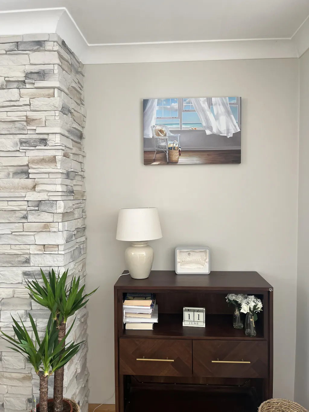
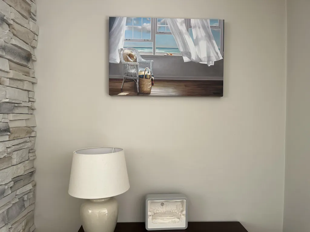
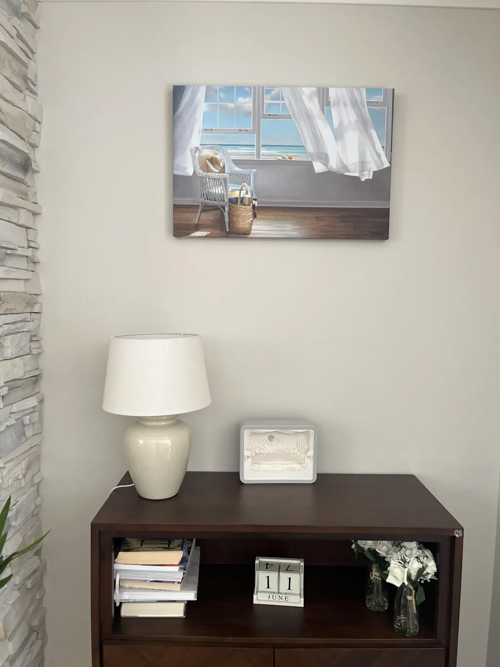
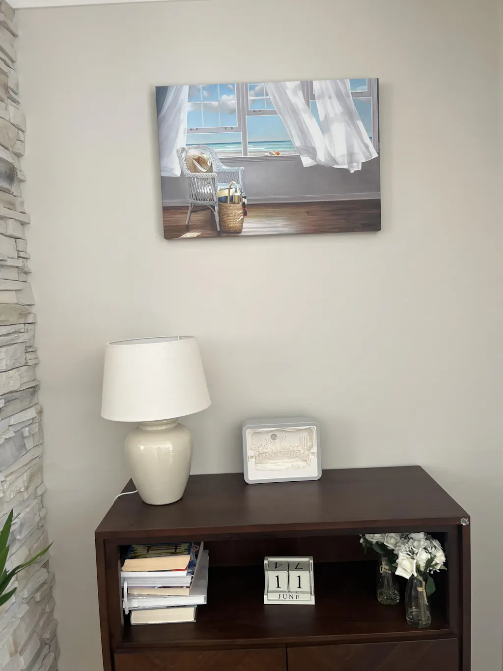
For art above furniture, use this benchmark first: the framed piece should span about two-thirds the width of the furniture below it, based on installation guidance for botanical wall art sizing.
That rule solves the two most common problems. One is buying art that's too small for the sofa or console, which makes it float awkwardly. The other is overfilling the width so the wall feels compressed.
Here's how that plays out in real rooms:
- Over a sofa: one large botanical work or a balanced multi-panel arrangement usually looks strongest
- Over a console: a single vertical fern or branch study can work if the furniture is narrow
- Over a bed: softer botanicals with wider visual spread help anchor the headboard wall
If you prefer grouped arrangements, a three-piece wall art layout can solve the width issue neatly without forcing one oversized frame.
Placement details that make art look intentional
Height matters just as much. The bottom edge of the frame should sit at least 8 inches above the top of the furniture. That clearance keeps the composition from feeling cramped and helps prevent accidental knocks.
Orientation is another practical tool. Vertical pieces suit narrow walls, gaps between windows, and spots beside cabinetry. Horizontal formats work better over sofas, sideboards, and beds because they echo the furniture line.
Before you commit to hardware, test the arrangement on the floor. That step saves a lot of unnecessary patching and usually reveals spacing problems quickly.
Lay out the frames first. If the composition looks crowded on the floor, it will look even tighter on the wall.
A quick visual demonstration can help before you measure and mark:
A few practical hanging habits make the final result cleaner:
- Measure from the furniture, not the ceiling. Furniture is the visual anchor.
- Check frame edges, not just centers. Symmetry often breaks at the outer lines.
- Use a second person for larger works. Big framed botanicals are harder to level than they look.
- Step back before the final nail goes in. Designer spacing often looks odd up close and correct from across the room.
Styling Ideas From Single Statements to Gallery Walls
Botanical wall art takes on a personal dimension. The same subject can feel serene, dramatic, scholarly, or playful depending on how you group it.
One large piece
A single oversized botanical work is often the cleanest answer for a room that already has enough going on. In a living room with textured upholstery, side tables, lamps, and books, one strong framed print can calm the composition instead of complicating it.
This works especially well with:
- a dramatic leaf silhouette
- a vintage floral plate enlarged to statement scale
- a soft abstract botanical in a restrained palette
The key is confidence. If you go for one piece, let it have presence.
A collected botanical gallery wall
Gallery walls suit people who like layered rooms and a more curated, lived-in finish. The mistake is making every piece too similar. When all the prints match perfectly, the wall can feel bought in one click rather than assembled with intention.
A better mix usually includes variation in at least two of these:
- Subject matter: leaves, stems, florals, seed pods
- Style: one or two vintage studies mixed with looser contemporary work
- Scale: medium anchors with smaller supporting pieces
- Frame finish: consistent family, not necessarily identical moulding

Sets and color-led arrangements
Diptychs and triptychs help when you want order without stiffness. Repeated botanical forms, such as three related leaf studies or a set of tonal florals, can bring rhythm to a dining room or hallway.
Color is where many people hesitate, especially if the room isn't obviously “green.” In practice, botanical art doesn't need to precisely match plants. It just needs to cooperate with the palette already in the room. Sage can link with stone, black can echo metal fixtures, terracotta florals can pick up timber tones, and pale neutrals can keep a bedroom quiet.
If you shop digitally, filtering by palette makes this easier than scrolling blindly. Tools such as framed art set inspiration help when you're building a coordinated wall rather than buying one standalone print.
A good styling check is simple. Remove the art in your mind and ask what the room is missing. Height, softness, color repetition, movement, or detail. The right botanical arrangement should answer that specific gap, not just fill empty plaster.
The Smart Buyer Guide to Botanical Prints
Style gets the attention. Longevity is what separates a satisfying purchase from one you regret.
A 2024 Graphic Arts Foundation study found that 68% of home buyers regret purchasing non-archival wall art due to premature fading and yellowing, a point discussed in this piece on why archival materials matter in wall decor. That regret makes sense. Cheap prints often look acceptable on day one and disappointing far sooner than buyers expect.
What to ask before you buy
The most useful quality questions are not glamorous, but they matter:
- Are pigment-based inks used? Pigment inks are associated with archival-quality reproduction. If a seller doesn't say what ink system is used, I get cautious.
- Is the paper archival or acid-free? That affects yellowing and general aging.
- What is the paper finish? Matte, textured matte, and satin each change the feel of the same image.
- Can you buy it framed from the source? That can remove guesswork around fit and protection.
- How is it packaged? Good art still arrives badly if the packing standard is weak.
Buyer rule: If the seller explains subject and style in detail but says almost nothing about inks, paper, or packaging, you're probably paying for appearance more than quality.
Where cheap prints get expensive
This is the part many guides skip. A low-cost unframed print can trigger what decorators often call the DIY framing tax. Once you add a custom frame, mat, glazing, backing, and your time, the “budget” purchase may stop looking economical.
That doesn't mean every buyer needs the most premium option. It means the starting price shouldn't be the only number you care about. Sometimes a ready-framed archival print is the smarter buy because the quality decisions have already been made properly.
If you want one concrete example of what to inspect on a product page, a listing like Botanical I shows the kind of format and presentation details worth checking before you commit.
The good purchase is the one that still looks composed on the wall years later. That depends less on trend and more on materials.
Frequently Asked Questions About Botanical Art
Can botanical wall art work in bathrooms or kitchens
Yes, but material choice matters. In more humid spaces, avoid flimsy paper presentations that can feel vulnerable. Look for more durable formats, and be careful about placing framed work where it gets direct steam or splashes.
How do I clean botanical prints
Dust frames gently with a soft dry cloth. Don't spray cleaner directly onto glazing or frames. If the piece is under glass or acrylic, spray the cloth first, then wipe carefully.
What's the difference between botanical illustration and botanical photography
Illustration usually feels more interpretive or studied, even when it's scientifically precise. Photography tends to feel crisper and more immediate. If you want a room to feel collected and timeless, illustration often wins. If you want clarity and freshness, photography can be the better fit.
Are florals and botanicals the same thing
Not quite. Floral art focuses mainly on blooms. Botanical art is broader and can include leaves, branches, roots, seed pods, stems, and whole plant studies. That wider vocabulary is one reason it's so versatile in interiors.
If you're ready to choose botanical wall art with more confidence, Printano is one place to compare formats, framing options, orientations, and color-led browsing in one catalog. That makes it easier to find a piece that suits both your room and the practical standards that help art last.