
You've probably got one of these spots in your home right now: a narrow strip of wall by the entry, a small patch above a desk, a bedside corner that feels unfinished, or a shelf that looks styled but not quite personal. Large art can be beautiful, but it often asks for commitment, budget, and a lot of wall confidence. Small art prints solve a different problem. They let you add character in a lighter, more flexible way.
They're also one of the easiest ways to make a room feel collected instead of just furnished. A single small piece can soften an awkward corner. A pair can bring rhythm to a hallway. A grouped arrangement can turn a blank wall into something layered and intentional, without making the room feel crowded.
Table of Contents
- The Big Impact of Small Art Prints
- How to Choose Art That Tells Your Story
- Getting the Details Right Size, Paper, and Quality
- From Single Prints to Stunning Gallery Walls
- Room-by-Room Inspiration for Small Prints
- Bringing Your Vision to Life
The Big Impact of Small Art Prints
Small art prints work so well because they meet real decorating needs. They fit the in-between spaces most homes have. They're easier to frame, easier to move, and much less intimidating to arrange than one oversized statement piece. In practice, that means you can test a style, shift a palette, or build a layered wall over time instead of trying to get everything perfect in one purchase.
That accessibility is shaping the wider category too. The global art prints market reached USD 5.6 billion in 2024 and is projected to reach USD 9.6 billion by 2033, with accessible small prints driving much of that demand. Small, affordable works now account for 85% of all art transactions, according to DataIntelo's art prints market report. That doesn't read like a compromise market. It reads like buyers actively choosing flexible, attainable art for everyday spaces.

Why small formats work so well at home
A small print can do one of two jobs. It can act as a quiet accent, or it can become part of a composition. That range is what makes it so useful for renters, first-time decorators, and anyone trying to make a home feel more personal without overcommitting.
A few trade-offs matter:
- Lower risk, more freedom. You can try abstract work, vintage botanical imagery, or photography without feeling locked in.
- Easier framing. Standard sizes are simpler to source and usually kinder to your budget.
- Better for layered rooms. If you already have bookshelves, lighting, textiles, and furniture doing visual work, a smaller piece often feels more balanced than a single oversized artwork.
Practical rule: If a wall is visually busy because of nearby furniture, lamps, shelving, or doorways, smaller art usually looks more intentional than one dominant piece.
Frames also change the equation. A modest print in the right frame can feel far more finished than a larger unframed poster. If you're weighing different presentation styles, floating frame prints are worth looking at for a cleaner, refined edge.
How to Choose Art That Tells Your Story
The best small art prints don't just “match the sofa.” They echo something about how you want the room to feel. That might be calm, playful, moody, grounded, airy, or eclectic. Starting there makes choosing art much easier, because you're editing by atmosphere instead of scrolling endlessly.

Start with the mood, not the wall
A modern room often benefits from art with strong shape and negative space. Abstract compositions, minimalist line work, and photography with clear contrast tend to sit well in cleaner interiors. If your room already has a lot of texture, such as boucle, linen, wood grain, or woven finishes, simpler artwork can keep the balance.
More traditional or softly layered spaces often suit botanicals, natural scenes, figurative sketches, and still life prints. Those subjects add familiarity and warmth without feeling stiff.
Ask yourself these questions before you pick anything:
- Do I want this room to feel quiet or energetic?
- Do I want the art to stand out or blend in?
- Am I building one focal point or a group that reads as a collection?
If you're also making a day of looking at work in person, The Ten District's art gallery guide is a helpful reminder that seeing different mediums and curatorial styles can sharpen your eye fast.
Use color as your editing tool
Color is the fastest way to make small prints feel cohesive. You don't need every piece to match exactly. In fact, that often looks flat. What you want is a thread. It could be repeated warm neutrals, muted greens, dusty blue, charcoal, soft terracotta, or black and cream.
A simple approach works well:
- Pull from the room. Repeat a color already present in a rug, cushion, throw, or ceramic object.
- Choose one anchor shade. Let one hue appear across multiple prints, even if the subjects differ.
- Add one contrast note. A room of pale neutrals often comes alive with a single darker or deeper print.
A cohesive wall rarely depends on identical art. It depends on repeated visual cues.
Shopping tools help here. Filters like “shop by color” are useful because they narrow the field before you get decision fatigue. That's especially helpful with small art prints, where the charm often comes from mixing styles while keeping the palette steady.
Choose a theme that gives the collection a backbone
Theme doesn't have to mean “all coastal” or “all floral.” Think of it more as a quiet organizing principle. Nature, architecture, portraiture, abstract form, typography, and travel scenes can all work. The key is choosing a theme broad enough to feel alive but clear enough to hold the group together.
Here's what usually works well:
| Approach | Best for | Watch out for |
|---|---|---|
| Single subject family | Calm, unified rooms | Can feel too expected if everything is identical |
| Mixed subjects, shared palette | Relaxed, collected interiors | Needs one repeated color thread |
| Mixed media, shared mood | Eclectic spaces with personality | Can turn chaotic if frames also vary wildly |
If you're style-curious, small prints are the safest way to experiment. An abstract piece that feels too bold at a large scale often feels fresh and elegant in a smaller frame.
Getting the Details Right Size, Paper, and Quality
A good decorating choice evolves into a satisfying one through attention to detail. Size, paper, and print quality affect how the piece feels in the room just as much as the artwork itself. A beautiful image on the wrong paper or in an awkward scale can fall flat.

Why size feels bigger than the numbers suggest
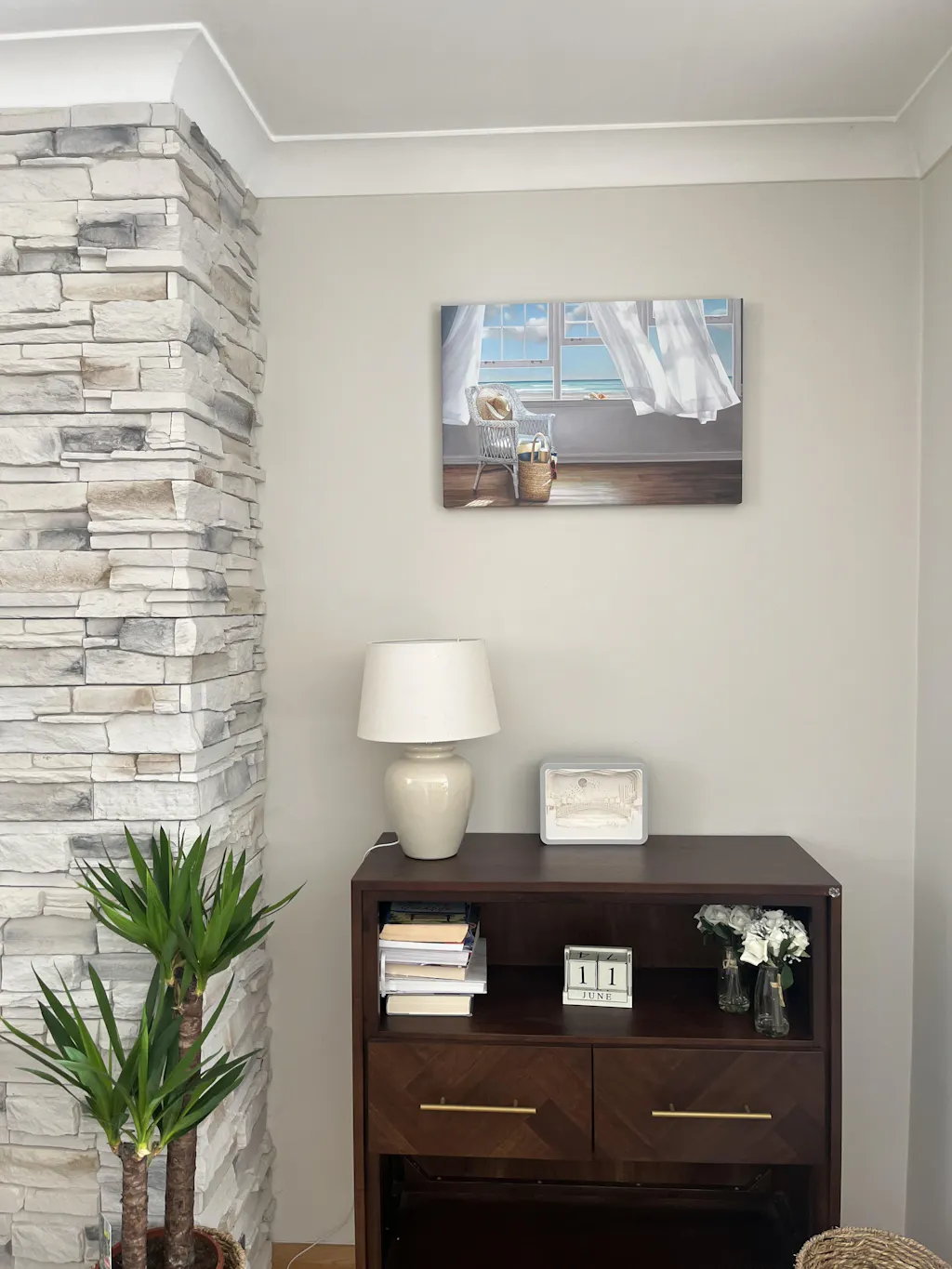
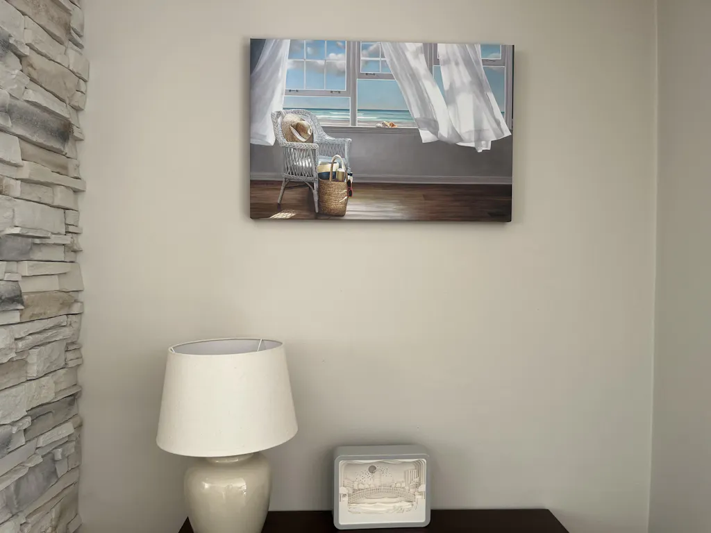
Among small print formats, the 8 by 10 inch size is the dominant seller, accounting for 29% of total sales in artist-tracked multi-year data, with 11 by 14 inch and 16 by 20 inch also ranking strongly on online marketplaces, as described in this small print sizing discussion on YouTube. The reason is practical. An 8 by 10 fits standard frames, ships easily, and works in more locations than almost any other format.
That said, “best” depends on placement.
- 8 by 10 works well on shelves, bedside walls, entry nooks, and layered gallery arrangements.
- 11 by 14 gives you a little more presence when the wall is visible from across the room.
- 16 by 20 can still read as refined and compact, but it has enough scale to anchor a small zone on its own.
If you're choosing between one striking print and a grouped arrangement, think about the furniture below it. A petite side table often wants one compact piece. A console or desk can hold a pair or trio with more ease.
For artwork with bolder shapes or modern color blocking, abstract wall art prints often work especially well in smaller formats because they keep the gesture crisp.
How paper changes the personality of the print
Paper is not a technical footnote. It changes the mood.
A satin photo paper finish usually gives colors more pop and clarity. It suits photography, graphic work, and art with richer contrast. A premium textured paper tends to soften the surface and create a more matte, tactile feel. That's lovely for scenery, painterly pieces, line drawings, and vintage-inspired art. Canvas introduces its own character entirely. It feels more traditional and less glassy, which can be useful if you want softness and a little visual weight without going too formal.
A quick comparison helps:
| Material | Best visual effect | Works well for |
|---|---|---|
| Satin photo paper | Crisp, vibrant, smooth | Photography, bold color, contemporary art |
| Textured paper | Matte, soft, tactile | Botanicals, sketch-like work, painterly pieces |
| Canvas | Classic, substantial, relaxed | Traditional rooms, layered neutrals, larger-feeling presence |
Cheap paper often looks flat or oddly shiny in domestic lighting. It can also make dark tones muddy and pale tones lifeless.
What museum-quality actually means
For small art prints to reproduce well, the file should be prepared at a minimum of 300 DPI at final size, with stronger detail retention often falling between 360 and 600 DPI. For giclée-based processes, archival prints may use resolutions from 1140 to 2880 DPI, with CMYK conversion, calibrated monitors, and paper-specific ICC profiles all helping color stay accurate, as outlined in this museum-quality giclée printing guide.
That sounds technical, but the visual result is simple. Fine detail stays sharp. Gradients look smooth instead of banded. Skin tones, shadows, and muted colors feel more natural. You don't need to obsess over production terms, but you do want to know that quality has been controlled before the print reaches your wall.
Good small art prints should reward close viewing. If the image falls apart when you step closer, the quality wasn't there to begin with.
From Single Prints to Stunning Gallery Walls
The fear with small art prints isn't usually choosing one. It's choosing several. People worry the wall will look busy, random, or unfinished. That anxiety makes sense because small pieces need relationship, not just placement.
Interest in this style is clearly rising. Artsy noted a growing appetite for gallery wall and salon-style décor, and searches for small prints increased by up to 49%, signaling strong demand for guidance on arranging multiple works without clutter, as reported by Observer's coverage of Artsy's 2025 buying trends.
Start with one arrangement type and commit to it. Most messy gallery walls come from mixing too many layout ideas at once.

The grid
A grid is the cleanest option. Use matching frames, keep spacing consistent, and let the repetition do the work. This arrangement is excellent above desks, sideboards, and beds where you want order.
A grid works best when the art shares either a common palette or subject. Black-and-white photography, line drawings, botanicals, and tonal abstracts all suit this format.
Keep these principles in mind:
- Match the frame profile. Thin black, light oak, or simple white all work.
- Keep spacing even. Consistency matters more than the exact gap.
- Treat the group as one shape. Center the overall block, not each frame individually.
If you want extra help with measurement and hardware, Short Furniture's picture hanging guide is a solid practical reference.
A short visual example often helps before you hang anything permanent.
The organic cluster
This is the arrangement people love in inspiration photos but often overdo at home. An organic cluster should feel relaxed, not accidental. The easiest way to keep it from looking chaotic is to hold one element steady. That could be the frame color, the palette, or the style of artwork.
Leave breathing room around the outer edge of the cluster. When every frame pushes outward, the whole wall starts to feel crowded.
A reliable method is to place your strongest piece slightly off-center first. Then build around it with smaller supporting works. Step back after every addition. If one side feels heavier, correct with tone or frame weight rather than just adding more pieces.
The ledge line-up
If you hate committing to nail holes, use picture ledges. Small prints layered on a ledge feel casual, collected, and easy to refresh with the seasons. This approach works particularly well in dining areas, kitchens, and hallways where you want softness rather than strict symmetry.
What makes a ledge arrangement look good is overlap and height variation. Lean one medium piece at the back, place a smaller framed print in front, and add one object with a different material, such as ceramic or brass, so the display doesn't become frame-only.
For people who prefer a coordinated starting point, gallery wall art sets can take some of the guesswork out of pairing pieces.
The diptych or triptych
Sometimes the strongest answer is the simplest one. Two or three prints hung together can feel complete without becoming a full gallery wall. This is especially useful in narrower zones where a cluster would look fussy.
Try a diptych when:
- You have a slim wall between windows or doorways.
- You want calm repetition rather than an eclectic mix.
- Your room already has pattern in rugs, textiles, or wallpaper.
A triptych works well when the pieces are connected by palette, horizon line, subject, or mark-making style. It gives you cohesion without stiffness.
Room-by-Room Inspiration for Small Prints
Some of the best placements for small art prints are the places people overlook. These are the spots where large-scale art can feel forced, but smaller pieces can make the room feel thoughtful and lived-in.
Home office
Above a desk, a tidy grid often works better than one large frame. It keeps the area structured and doesn't overpower the work surface. Choose pieces with enough visual interest to lift the mood, but not so much intensity that they become distracting during the day.
If your office is neutral, try prints with restrained color and strong line. If the space feels flat, a pair of warmer-toned abstracts can bring in energy without noise.
Hallway
Hallways benefit from repetition. A vertical run of small framed prints can make a narrow passage feel taller and more deliberate. Keep the frames consistent, and let the subject shift gently from piece to piece.
This is a great place for travel photography, sketches, architectural details, or botanical studies. In a transitional space, art that reads quickly tends to work best.
Bookshelves and consoles
Shelves are ideal for small art because you can layer rather than commit. Lean a framed print behind a stack of books, place a smaller one beside a vase, and use negative space so the arrangement still breathes.
The mistake here is treating every shelf the same. One shelf can hold art as the focus. Another can use it as backdrop. Varying that rhythm makes the whole unit feel designed instead of overfilled.
A small framed print on a shelf should look discovered, not parked.
Kitchen and bathroom
These rooms are often missing personality because people stop at function. A single whimsical print in a kitchen can soften tile, cabinetry, and hard surfaces. In a bathroom, one small artwork can make the room feel considered rather than purely practical.
Food illustrations, vintage labels, playful line drawings, seascapes, and quiet natural scenes all work nicely here. Just keep the framing simple and the scale modest.
Bedroom
Bedrooms respond well to softer, quieter art choices. A pair of small prints over bedside tables can look more graceful than one large piece above the headboard, especially if the room is compact. Gentle natural scenes, abstract forms, florals, or muted photography tend to suit the atmosphere.
If you want a little more direction for this room in particular, framed art for bedroom spaces offers useful styling ideas around proportion and mood.
Bringing Your Vision to Life
Good decorating decisions usually come down to a few clear choices. Pick art that suits the feeling of the room. Choose a size that matches the wall and furniture, not just the empty space. Decide whether you want crisp vibrancy, a matte tactile finish, or a more classic canvas look. Then commit to one arrangement style so the result feels intentional.
The final hesitation is usually practical. People worry about whether framed pieces will arrive ready to hang, whether prints will travel safely, whether shipping will become expensive, or whether they'll be stuck with something that doesn't work in the room. Those concerns are reasonable, especially with wall art.
That's why the details around fulfillment matter. Ready-to-hang framing options reduce the last-mile hassle. Protective packaging helps preserve corners, glass, and surface quality. Free worldwide shipping removes a common point of friction, and a return window gives you breathing room if a piece doesn't suit the space as expected. If you're still refining placement after buying, this guide on how to hang wall art can help you finish the job with confidence.
If you're ready to turn those blank corners, shelves, and narrow walls into something personal, explore the collections at Printano. It's a practical place to start when you want museum-quality wall art, flexible framing options, and enough variety to build a look that feels like your home instead of a showroom.