
You've made the bed, layered the pillows, maybe swapped the lamp shades, and the room still feels unfinished. The wall above the bed is blank, and every framed piece you consider seems to create a new question. Too small? Too busy? Too bold for a room that's supposed to help you sleep?
That hesitation is normal. Bedrooms are different from living rooms. A dramatic piece that feels exciting in a hallway can feel restless at bedtime. The right framed art for bedroom walls has to do two jobs at once. It needs to fit the wall well, and it needs to support the mood you want when the day is over.
A restful bedroom usually comes together when the art feels intentional rather than merely decorative. Subject matter matters, but so do proportion, framing, spacing, and what your eye lands on when you walk in and when you lie down. If you want a broader foundation for building that calm feeling, Printano's guide on using wall decor to create a relaxing bedroom retreat is a helpful companion to the decisions below.
Table of Contents
- From Blank Wall to Personal Sanctuary
- Assess Your Bedroom's Mood and Scale
- Select the Perfect Art Size and Theme
- Choose Frames to Elevate Your Style
- Master Art Layout and Hanging Techniques
- Add Finishing Touches and Ensure Longevity
From Blank Wall to Personal Sanctuary
A bedroom often looks complete on paper before it feels complete in real life. The bed is centered. The nightstands are in place. The palette works. But without art, the room can feel temporary, as if no one has fully moved in emotionally.
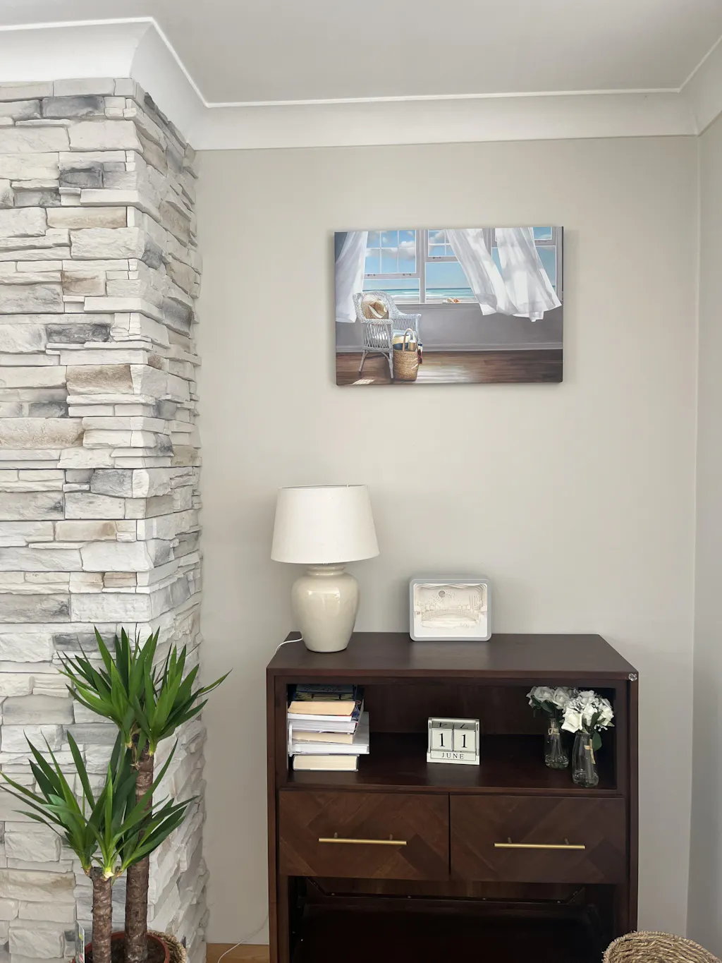
That's why framed art for bedroom spaces carries more weight than people expect. It doesn't just fill the largest open wall. It sets the tone for how the room is read. Quiet and grounded. Airy and restorative. Softly layered. Crisp and minimal. The difference usually comes down to choices that seem technical at first, then end up shaping the whole emotional temperature of the room.
A bedroom sanctuary isn't built by adding more. It's built by editing well. One carefully scaled framed print can calm a wall better than several pieces competing for attention. A thoughtful frame can make a familiar image feel warmer, softer, or more architectural. Placement can make the room exhale.
Bedrooms reward restraint. If the wall art feels loud, the room rarely feels restful.
The most successful bedrooms usually share one quality. Every visual choice supports rest, even when the style itself isn't minimal. That means the art belongs to the room rather than interrupting it.
Assess Your Bedroom's Mood and Scale
Before choosing art, pause and assess the room you already have. Most art mistakes happen because people shop by image first and placement second. In a bedroom, that order usually leads to something that looks good on a screen and unsettled on the wall.

Start with the feeling, not the frame
Ask a more useful question than “What art do I like?” Ask, “How do I want this room to feel when I enter it at night?”
That answer narrows your choices fast.
-
If you want quiet and soft
Look for gentle movement, limited contrast, and compositions that don't demand constant attention. -
If you want clean and modern
Simpler geometry, negative space, and restrained framing usually work better than heavily layered imagery. -
If you want warmth and comfort
Organic subjects, muted natural scenes, textile-like textures, and natural-looking frame finishes often help the room feel less sharp.
The art doesn't need to be sleepy. It needs to avoid visual friction. Bedrooms can handle personality, but they rarely benefit from chaos directly above the headboard.
Read the room before you shop
Scale matters as much as mood. An independent photography and framing guide notes that sizing art for specific beds is a common challenge, that the wall above the bed is often the largest art location, and that the artwork should generally be slightly narrower than the bed itself. The same guide also makes a useful contrarian point: bigger isn't always better in bedrooms, because a carefully sized piece can feel calmer and more intentional than a massive statement work, as discussed in this bedroom wall art guide by Richard Wong Photography.
That's exactly how a stylist reads the room. Not by asking how much wall can be covered, but by asking how much visual energy the room can comfortably hold.
Use this quick room check before you buy:
-
Look at ceiling height
Lower ceilings usually suit art that feels grounded and horizontal. Taller walls can handle more vertical emphasis or stronger frame presence. -
Study the headboard shape
A tall upholstered headboard already has visual mass. The art above it should complement, not crowd it. -
Notice the light
Bright rooms can hold darker tones and stronger contrast. Dimmer rooms often benefit from art that reflects light softly and doesn't disappear by evening.
The goal isn't to maximize size. The goal is to create balance between the bed, the wall, and the feeling of the room.
Select the Perfect Art Size and Theme
A strong bedroom scheme usually starts with proportion. Subject matter matters, but the wall often tells you the right format before the image does.

Use format first thinking
Recent market examples point to strong demand for large horizontal and panoramic framed formats for bedroom walls, with listings showing sizes up to 24x72 inches, reflecting a broader format-first planning approach where buyers choose by proportion and orientation before subject matter, as seen in this panoramic framed print listing on Etsy.
That trend makes sense above a bed. The wall is usually wide. A horizontal format echoes the furniture below it, which creates a calmer visual relationship than forcing a shape that fights the architecture.
Here's how to think about orientation:
- Horizontal art works well above most beds because it follows the room's widest line.
- A square piece can be useful when the headboard is visually substantial and you want the wall to feel centered and contained.
- Vertical art often works better beside the bed, on an adjacent wall, or in bedrooms with unusual architecture rather than directly over a wide headboard.
If you want a broader decorating reference beyond the bedroom, this expert guide on home wall art gives helpful context on how scale and style interact in different rooms.
Choose subject matter that supports rest
Theme affects your nervous system more than is commonly acknowledged. In a bedroom, images should hold attention gently.
Good candidates often include:
- Abstracts with soft movement that give the eye somewhere to wander without creating tension.
- Natural settings and horizon lines that feel expansive but not dramatic.
- Botanical forms with simple silhouettes rather than dense, high-contrast detail.
- Architectural or geometric pieces when the room itself is minimal and benefits from structure.
What usually works less well above a bed? Art that feels confrontational, cluttered, or narratively intense. A bedroom doesn't need to become bland, but it should feel settled.
Match art to what already lives in the room
The easiest way to choose framed art for bedroom schemes is to pull color cues from materials already in the space. Start with bedding, curtains, rugs, and the headboard fabric. If two of those elements share a tone, use that as your bridge into the artwork.
One practical option is to shop by palette rather than by category. Printano offers a large-scale art guide focused on oversized statements, and its browsing tools also let shoppers filter by color, which is useful when you're trying to connect new framed art to tones already present in the room.
A simple styling method works well:
- Pull one dominant room color.
- Add one supporting neutral from the furniture or textiles.
- Choose art that includes both, even if subtly.
- Let the frame either disappear into the palette or provide a deliberate contrast.
That last choice matters. If the room is already layered and textured, the frame can be quiet. If the room is simple, the frame may need to do more visual work.
Choose Frames to Elevate Your Style
People often decide on the print and treat the frame like packaging. In bedrooms, that's a mistake. The frame is part of the mood. It changes the temperature of the artwork, its apparent size, and how polished or relaxed the room feels.

Frame material changes the mood
The same print can read three completely different ways depending on the frame.
- Black metal or slim black wood gives art a graphic edge. It's useful in modern bedrooms with crisp bedding, darker accents, or clean-lined furniture.
- Natural wood adds warmth. It softens photography, abstracts, and monochrome work, especially in rooms with oak, linen, cane, or warm neutrals.
- White frames can make a room feel lighter and less visually dense, especially when the wall color is deeper or the artwork itself is subtle.
- Brass or gold-toned finishes work best when they repeat another metal already in the room, such as sconces, drawer pulls, or lamp bases.
Clear acrylic can also be effective in bedrooms that need visual lightness. For a nuanced look at when transparency helps rather than disappears, this piece on styling clear lucite frames offers useful ideas.
A frame should either connect the art to the room or intentionally sharpen it. If it does neither, it usually feels random.
Thickness, matting, and visual weight
Frame width changes perceived scale. That matters when you're trying to calm a bedroom rather than dominate it.
A few reliable pairings:
-
Thin frame, no fuss
Good for contemporary prints, minimal rooms, and wide pieces where the shape already does the work. -
Medium wood frame with matting
Useful when the print is visually rich and needs breathing space. Matting can slow the eye down and make the arrangement feel quieter. -
Chunkier frame in a simple room
A thicker profile can help a modestly sized piece hold its own without having to choose a louder image.
Floating styles deserve special mention because they add depth without heaviness. If you're considering that look, Printano's article on floating frame prints gives a clear overview of how that presentation changes the finish of the piece.
Bedrooms respond well to frames that feel resolved. Not fussy, not accidental. If the artwork is the voice, the frame is the tone of that voice.
Master Art Layout and Hanging Techniques
Good art can still look wrong if the layout is off by a small margin. This is the stage where bedrooms either gain that composed, sanctuary-like quality or end up feeling awkward without anyone knowing why.
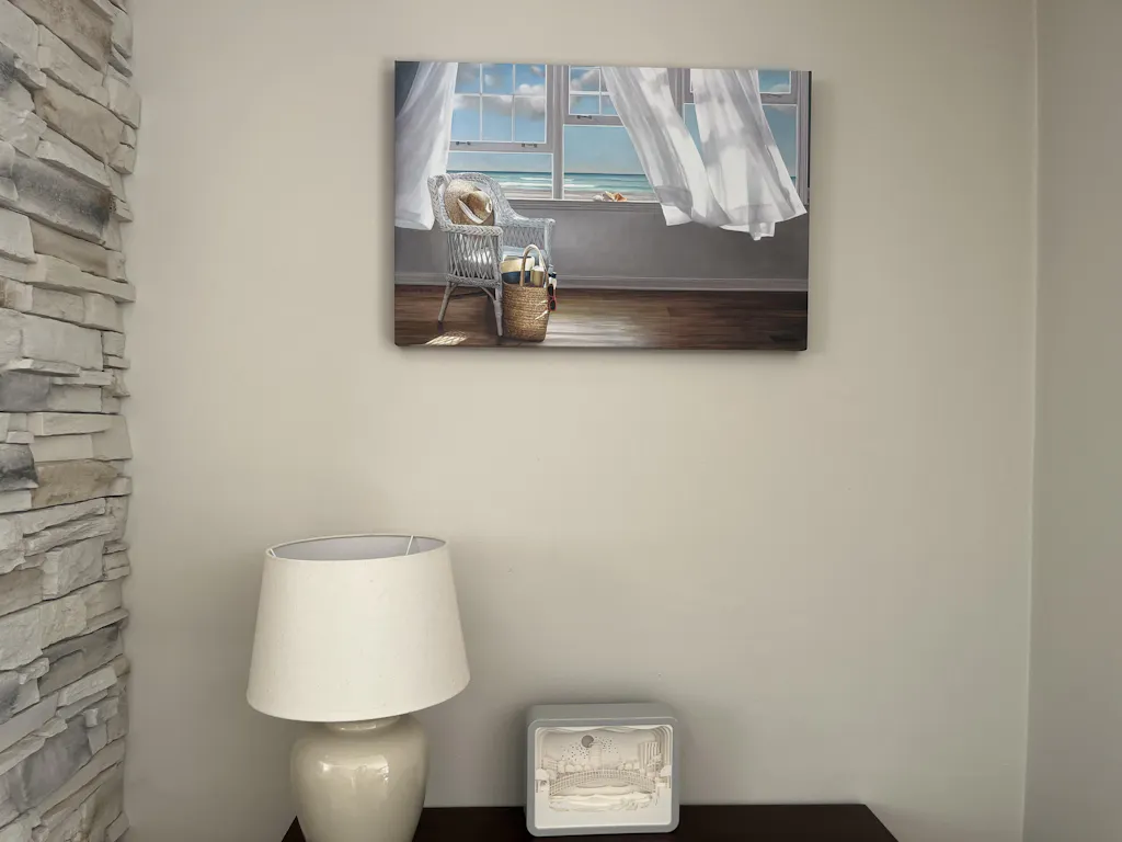
Start with the clearest rule. A widely used guideline for art above a bed is the two-thirds rule. The artwork, or grouped arrangement, should span about 50% to 75% of the width of the headboard or furniture, often described as roughly two-thirds. Designers also recommend hanging framed art about 6 to 8 inches above the headboard and keeping 4 to 5 inches between frames in a multi-piece arrangement so the grouping reads as one unit, according to this art-above-bed sizing and spacing guide.

Use one sizing rule and trust it
When people struggle with framed art for bedroom walls, they usually overcorrect in one direction. They either hang something too small because it feels safe, or they buy something so oversized that it overwhelms the bed.
The two-thirds rule keeps both mistakes in check.
A practical way to apply it:
- Measure the visible width of the headboard or the bed zone you want the art to relate to.
- Choose a single framed piece or grouped set that fills roughly half to three-quarters of that width.
- Keep the bottom edge visually connected to the bed by hanging it within the recommended distance above the headboard.
Practical rule: If you're deciding between slightly smaller and noticeably larger, the calmer bedroom usually benefits from the slightly smaller choice.
A grouping counts as one visual shape. Two frames or three panels can work beautifully if the combined width follows the rule and the spacing stays tight enough to read as a set.
A useful option for more personal arrangements is a collage-based composition. If you're leaning in that direction, these beautiful framed photo collages are a good reference for how multiple images can still feel cohesive.
Layout options that work above a bed
Different bedrooms call for different structures. The key is choosing one and committing to it cleanly.
Single statement piece
This is the easiest route when the room already has texture in the bedding, lighting, or headboard. One piece creates the least visual noise and often feels the most restful.
Balanced pair
A pair works well when you want symmetry without the weight of one large image. Keep the frames related, and let the duo read as one horizontal block.
Triptych
Three coordinated panels suit long walls and can feel elegant when the imagery has continuity. Spacing matters here. If the gaps grow too wide, the set loses its unity.
Small gallery cluster
This can work in eclectic or highly personal bedrooms, but it needs discipline. Limit the palette, control the frame language, and avoid climbing too high above the bed.
For anyone decorating with grouped works rather than a single print, Printano's guide on how to decorate with sets of framed art is a practical reference.
A short demonstration helps if you like seeing the mechanics before you hang anything. This video is useful for that:
A practical sizing table for bed widths
Use this table as a quick planning tool, then adjust for ceiling height, frame thickness, and how visually heavy the piece feels.
| Bed Size | Bed Width (Approx.) | Recommended Artwork Width |
|---|---|---|
| Twin | Narrow bed width | About 50% to 75% of the bed or headboard width |
| Full | Medium bed width | About 50% to 75% of the bed or headboard width |
| Queen | Wide bed width | About 50% to 75% of the bed or headboard width |
| King | Wider bed width | About 50% to 75% of the bed or headboard width |
That table stays intentionally simple because bed dimensions vary by maker, headboards add or subtract visual width, and frames change perceived mass. The ratio is more reliable than chasing a one-size-fits-all answer.
Add Finishing Touches and Ensure Longevity
Once the art is up, a few final choices determine whether it keeps adding calm or starts causing small annoyances. Lighting is first. If a bedside lamp throws glare across the glass, shift the lamp, bulb direction, or shade before assuming the art is wrong. Soft, angled light usually flatters framed work better than direct frontal light.
Cleaning matters too. Dust the frame regularly with a dry, soft cloth. Clean glazing carefully and lightly, and avoid saturating corners where moisture can creep toward the frame edge. Wood, metal, and acrylic all age differently, so a gentle touch is better than aggressive polishing.
The finishing layer is seasonal attention. Bedrooms change with bedding, wall color, and light levels through the year. If the room starts to feel stale, you don't always need new furniture. A reframed print, a new mat color, or a different piece above the bed can shift the whole atmosphere. Printano shares ideas along those lines in its article on refreshing your wall decor for the new year with framed art.
The bedrooms that feel best aren't always the most decorated. They're the ones where every element supports rest, and the art helps the room feel inhabited, settled, and personal.
If you're ready to choose framed art that fits your wall and supports the mood you want for relaxation, Printano offers wall décor in multiple sizes, orientations, and frame finishes, along with color-based browsing that can help narrow options for bedroom spaces.