
You're probably looking at a wall that feels too empty to ignore, but too important to get wrong. It might be the stretch above the sofa, the hallway that still feels unfinished, or the bedroom wall that needs more than one oversized print. A gallery wall is often the answer, but it also tends to trigger the same hesitation: how do you make it look collected and stylish instead of random and cramped?
That hesitation is normal. The best gallery walls don't start with a hammer. They start with a point of view. They tell a story about the room and the people living in it, whether that story is calm and tonal, bold and graphic, or layered with a mix of art, photography, and personal pieces. That's one reason curated collections have become such a strong part of the category. The global wall art market is projected to grow from $59.51 billion in 2025 to $82.36 billion by 2030, with a significant portion of that demand tied to people buying coordinated collections for cohesive interiors, according to The Business Research Company wall art market report.
Table of Contents
- From Blank Wall to Beautiful Statement
- Finding Your Narrative by Choosing the Right Art
- The Blueprint for a Perfect Layout
- Customizing Your Collection for a Perfect Fit
- Bringing Your Vision to the Wall
- Advanced Styling and Breaking the Rules
- Your Gallery Wall Questions Answered
From Blank Wall to Beautiful Statement
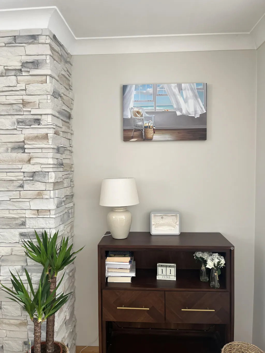
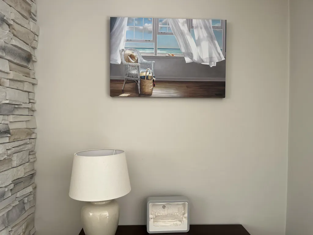
A blank wall can make a room feel unfinished even when everything else is in place. I see this most often in living rooms where the furniture works, the rug works, the lighting works, and then one large wall keeps the whole space from feeling resolved. That's where gallery wall art sets earn their place. They give you structure, rhythm, and enough visual variation to make a room feel personal.
Individuals don't struggle because they lack taste. They struggle because they try to solve everything at once. They ask what size, what style, what spacing, what frame finish, and what arrangement before they've decided what the wall is supposed to say. A good gallery wall isn't just decoration. It's a statement about the mood of the room.
Start with the wall's job
Some walls need to anchor a seating area. Others need to soften a corridor or bring intimacy to a bedroom. If you want a practical refresher on how art changes the feel of a room, this guide on enhancing your home's design wall is useful because it frames wall decor as part of the architecture, not an afterthought.
That mindset helps you choose whether your gallery should feel restrained, playful, formal, or relaxed. If the wall is doing the heavy lifting in the room, your set should read as one composition rather than a cluster of unrelated pieces.
Practical rule: Treat the gallery as one artwork made of several parts. If each frame fights for attention, the wall will feel noisy.
Why sets work so well
Curated sets remove one of the biggest design problems. They build cohesion from the start. You're not trying to force unrelated prints into a relationship after the fact. You're working with pieces that already share a visual language.
That's especially helpful if you're decorating a larger surface and want impact without guesswork. If your wall needs more scale than a single print can provide, large wall art ideas for empty spaces can help you think through when a grouped arrangement creates more depth than one oversized piece.
Gallery wall art sets also make high-end styling more approachable. You don't need a showroom-sized budget or years of styling experience. You need a clear story, good proportions, and the discipline to stop before the wall becomes cluttered.
Finding Your Narrative by Choosing the Right Art
The strongest gallery walls feel edited. Even when they look relaxed, someone made a series of smart choices about mood, palette, and subject matter. That's what separates a wall that feels collected from one that feels accidental.
Before you think about spacing or hanging height, decide what the collection is about. Not in an overly serious way. Just enough to give the wall direction.

Choose a theme that can carry a room
A theme doesn't need to be literal. It can be based on subject, color, energy, or even texture.
A few combinations work especially well:
- Quiet and layered: scenic views, soft abstracts, line drawings, muted tones
- Graphic and modern: black-and-white photography, high-contrast abstracts, geometric forms
- Warm and organic: botanicals, earthy palettes, natural textures, softened greens and neutrals
- Eclectic but controlled: mixed subjects united by one frame finish and a restrained palette
If the room already has strong furniture lines or patterned textiles, choose art that balances that energy. A busy room usually benefits from calmer imagery. A minimal room often needs art with more movement and contrast.
Build around color first
Color is the fastest way to create unity. I usually tell clients to pull from what already exists in the room instead of forcing the wall to introduce an entirely new palette. Start with two dominant colors already present in the space, then choose art that repeats or complements them.
That doesn't mean every piece has to match exactly. In fact, perfect matching often looks flat. Better results come from working within a family of tones. Charcoal with warm ivory. Olive with soft blush. Rust with sand and black.
If you like a nature-led approach, botanical wall art for layered interiors is a useful direction because it often blends beautifully with existing upholstery, wood finishes, and neutral walls.
A gallery wall reads as intentional when the colors repeat just enough for your eye to connect the pieces without noticing the mechanism.
Don't buy only “safe” pieces
One common mistake is choosing six prints that are all equally quiet. The wall becomes polite, but forgettable. You need variation inside the collection.
Use this simple mix:
- One anchor piece with the strongest visual pull.
- Two supporting pieces that repeat either the color or the mood.
- Smaller connectors that soften transitions and keep the arrangement from feeling blocky.
This is also where personal taste matters most. If you love vintage-feeling florals, stark architecture photography, or abstract forms that lean moody, use that preference. Gallery wall art sets work best when they feel specific to the home.
What doesn't work
A few choices cause problems fast:
- Too many styles at once: painterly florals, pop graphics, travel photos, and minimalist line art rarely cooperate without a very strong curatorial eye.
- No common thread: if subject, palette, frame finish, and mood all change at once, the arrangement loses shape.
- Decorating for trend only: if you don't like the art, the wall will feel temporary no matter how polished it looks.
Good curation isn't about following a formula. It's about deciding what belongs together and having the restraint to leave the rest out.
The Blueprint for a Perfect Layout
Layout is where most gallery walls either settle into balance or start to fall apart. Good art can still look wrong if the arrangement feels too top-heavy, too scattered, or disconnected from the furniture below it. The fix isn't guessing on the wall. It's planning on the floor first.
Professional designers use a floor layout method: measure the wall, tape those same dimensions on the floor, arrange every piece inside that outline, photograph the final arrangement, and hang beginning with the largest piece placed off-center, as described in Emily Henderson's gallery wall method.

Use the floor before the wall
This step saves holes, time, and frustration. It also lets you see the composition as a whole instead of reacting frame by frame.
Follow this sequence:
- Measure the target area. Include nearby furniture, molding, and switches so you know the exact boundaries.
- Tape the wall shape on the floor. Use painter's tape to create a box matching the width and height available.
- Place the largest piece first. Don't default to dead center. Off-center placement often feels more natural.
- Add the second-largest piece diagonally opposite. This keeps visual weight balanced.
- Fill with smaller pieces. Mix vertical and horizontal orientations so the arrangement doesn't feel stiff.
- Photograph the layout. Your phone becomes the reference while hanging.
For readers considering a more compact composition, 3-piece wall art layout ideas can be especially useful because smaller sets demand tighter proportion control.
Keep the arrangement unified
Spacing matters because your eye reads the empty space as part of the design. Industry guidance commonly places frames 5 to 7 cm apart, which is roughly 2 to 3 inches, and recommends treating the whole gallery as one artwork while keeping the lowest frame 15 to 20 cm above furniture and the center at eye level around 145 to 155 cm from the floor, according to Noonstead's gallery wall layout guide.
That standard works because it keeps separate pieces visually connected without making them touch or blur together.
A no-fail wall check
Before hanging, make paper templates for each frame and tape them to the wall. This sounds fussy, but it's the final quality-control step that catches the problems you didn't notice on the floor.
Look for these issues:
- A drifting top line: common when frames are similar in size but not intentionally aligned
- A weak focal point: the eye should land somewhere first
- Uneven outer edges: not every edge needs to align, but random edges can make the layout wobble
- Too much center crowding: amateurs often compress the middle and leave awkward gaps around the perimeter
If the paper version already feels slightly cramped, the framed version will feel more cramped once glass, mats, and shadows are added.
A polished gallery wall usually comes from editing, not adding. If one piece keeps making the arrangement harder to resolve, remove it.
Customizing Your Collection for a Perfect Fit
Once the layout is settled, the finer choices start doing more of the visual work. Material, orientation, and size affect the mood of the wall as much as the artwork itself. A tonal abstract on textured paper reads differently than the same image on canvas. A vertical print can lift the eye. A horizontal one can calm and widen the composition.
One reason gallery wall art sets are so versatile is that they let you shape the room with these smaller decisions.
Size gives the wall its rhythm
Some sizes are easier to live with. Medium-sized artworks such as 16" x 20" and 18" x 24" are the most popular choices for home decor, in part because they fit comfortably into residential rooms and work well inside multi-piece sets, according to Naturalist Gallery's overview of art sizes that sell best.
Those sizes are useful because they're substantial enough to hold a wall, but not so large that every arrangement becomes heavy. In practice, they work especially well as anchor or near-anchor pieces in living rooms, bedrooms, and dining spaces.
Orientation changes movement
A gallery wall gets better when every piece isn't the same shape.
Use orientation deliberately:
- Vertical pieces add lift and work well near doorways or narrower wall sections.
- Horizontal pieces relax the composition and pair naturally above sofas, credenzas, and beds.
- Square pieces act like pauses. They're good for filling gaps without making the wall feel directional.
Mixing these creates rhythm. Too many horizontals can make the wall sag. Too many verticals can make it feel jumpy.
Choosing Your Art Material
| Material | Aesthetic | Best For | Framing |
|---|---|---|---|
| Framed print | Crisp, tailored, classic | Living rooms, hallways, more formal spaces | Usually strongest when frame finishes stay consistent |
| Canvas | Softer, more relaxed, gallery-like | Casual interiors, larger wall spans, low-glare areas | Often works without an added frame |
| Textured paper print | Matte, tactile, slightly more artisanal | Layered interiors, earthy palettes, quieter art | Looks elevated with clean framing and generous matting |
| Satin photo paper print | Smooth, sharp, versatile | Photography, graphic pieces, budget-conscious builds | Can be framed simply or used in matching sets |
If you're weighing how edge detail changes the final look, floating frame prints compared with standard framing can help clarify where that extra definition makes a difference.
What works better than people expect
A mixed-material gallery can work, but only when there's one clear element holding it together. That might be a common frame finish, a repeated color family, or a very controlled subject range.
What usually works best for most homes is simpler: one dominant material, one frame story, and variation through scale and orientation instead of through too many competing finishes.
Bringing Your Vision to the Wall
Installation is where careful planning pays off. If you've done the floor layout and paper templates, hanging day becomes a transfer exercise, not a guessing game.
You don't need a long tool list. You need the right basics and enough patience to check alignment before each hole.
Gather the essentials
Keep these within reach:
- Measuring tape for transferring template positions accurately
- Level for keeping each frame straight
- Pencil for light wall marks
- Hooks or hanging hardware matched to the piece
- Hammer for standard hardware
- Painter's tape to hold templates and mark guide points
If you want a more detailed walkthrough for different wall types and hanging methods, how to hang wall art cleanly and securely is a useful companion.
Hang in a steady order
Start with the anchor piece. Once that frame is up and level, hang the next largest piece based on your layout reference photo. Work outward from there.
A few habits make the process cleaner:
- Mark from the hanging point, not the frame edge: hardware placement varies, so never assume the top of the frame equals the hook position.
- Step back often: what looks level from six inches away can look off from across the room.
- Check spacing as you go: don't wait until the end to discover drift.
- Keep the photo visible: your planned composition is the standard, not your memory.
Crooked frames rarely come from bad taste. They come from rushing the transfer from template to wall.
Avoid the common finishing mistakes
The last ten percent matters. Wipe smudges off the wall, straighten every frame after hanging, and look at the arrangement in both daylight and lamplight. Shadows can exaggerate unevenness.
If one frame keeps looking wrong, it probably is. Adjust it. The difference between homemade and polished usually comes down to that final round of refinement.
Advanced Styling and Breaking the Rules
Most gallery wall advice stops at one rule: keep spacing consistent and stay inside the standard gap. That advice is useful for classic layouts, but it isn't the whole story anymore. Some of the best-looking walls now feel less grid-bound and more lived in.
Emerging design directions for 2025 to 2026 favor intentionally broken spacing, with drifts between 1 and 6 cm, to create more dynamic and asymmetric compositions instead of rigid showroom grids.

When broken spacing looks better
Broken spacing works best when the art itself has personality and the room doesn't want to feel overly formal. Think collected living rooms, creative home offices, stair walls, or spaces with vintage furniture mixed into newer interiors.
The key is that the spacing drift must look intentional. Random isn't the same as relaxed.
A good approach:
- Keep one area tighter so the eye reads a cluster.
- Let another area breathe a little more.
- Repeat a visual thread such as frame color, subject, or tone so the arrangement still holds together.
- Protect one strong anchor piece so the whole wall doesn't dissolve into fragments.
How to break the rule without making a mess
If you want a more organic wall, break spacing in small ways, not all at once. Don't vary every gap and every alignment. Hold some order in place.
This combination tends to work:
- Consistent overall footprint
- One obvious focal piece
- A few drifting gaps
- Mixed edges rather than perfect perimeter alignment
What usually fails is trying to create movement by pure irregularity. Without an anchor, asymmetry looks accidental.
The wall should feel collected, not careless. Organic layouts still need discipline.
How many gallery walls belong in one room
This is the question often skipped, and it matters more than frame spacing. A room can handle more than one art moment, but it can't handle visual competition on every surface.
Current guidance in the underserved design conversation points to 70% wall area coverage as the upper limit, with 30% blank space needed to keep a room from tipping into visual chaos. The practical takeaway is simple. If one sightline already includes a busy gallery, the next wall often needs a reset. That reset can be negative space, a mirror, or a single oversized piece.
In real rooms, this means one major gallery wall usually deserves to be the star. A second display should be quieter. If both walls are dense, bold, and equally busy, the room starts to feel restless.
Your Gallery Wall Questions Answered
Can I mix personal photos with art prints
Yes, and it often makes the wall better. The cleanest way to do it is to keep one thing consistent. Usually that's the frame finish or the color palette. Black-and-white photos mix especially well with abstract and natural imagery because they don't fight for attention.
What if I'm renting
Use removable hanging solutions for lightweight pieces where appropriate, or lean larger framed works on shelves, mantels, or furniture. Renters often get the best results from smaller gallery wall art sets because they can create impact with fewer commitment points in the wall.
How do I add more pieces later
Don't squeeze new art into every open gap. Remove the existing arrangement mentally first, then reassess the whole shape. The best expansions preserve the original focal point and extend the composition in one deliberate direction rather than inflating it from all sides.
Should all the frames match
Not always. Matching frames create polish fast. Mixed frames create character. If you mix them, keep the palette disciplined so the variety looks curated instead of chaotic.
If you're ready to build a gallery wall that feels personal and polished, explore Printano for museum-quality art prints, framing options, and a wide range of sizes, styles, and orientations that make it easier to assemble a set that fits your room.