
You're probably here because a wall in your home still feels unfinished. The sofa is in place, the rug works, the lighting is decent, but the wall above it stays blank because choosing art somehow feels harder than choosing furniture. Too big and it overwhelms the room. Too small and it looks accidental. The frame color seems simple until you realize it changes the whole mood.
That's why white frame wall art is such a helpful starting point. It removes one big decision from the process and gives you a clean, flexible base that works with modern, coastal, Scandinavian, traditional, and mixed interiors. A white frame can soften bold artwork, freshen muted artwork, and make a room feel more settled without asking you to redesign everything around it.
A lot of people don't need more inspiration. They need a clear set of decisions they can trust. That's what makes decorating feel easier.
Table of Contents
- Your Guide to White Frame Wall Art
- The Enduring Appeal of White Frames
- How to Select the Perfect Artwork and Size
- A Guide to Materials and Print Quality
- How to Style White Frame Wall Art
- Ordering Care and Troubleshooting
- Bring Your Walls to Life With Confidence
Your Guide to White Frame Wall Art
A blank wall usually creates two reactions. Some people rush to fill it with the first thing that seems safe. Others keep waiting for the “right” piece and end up living with emptiness for months. Both reactions come from the same problem. Art feels personal, but hanging it also involves size, scale, placement, finish, and frame style.

White frame wall art helps because it brings order to that decision. The frame reads as light, neat, and adaptable. It doesn't fight with wood tones, pulls together mixed textiles, and gives artwork a finished edge that feels intentional even in simple rooms.
Think about a soft abstract print above a beige sofa, a black and white photograph in an entry, or botanical art in a bedroom. In each case, the white frame acts like a visual pause around the artwork. That pause is what makes the whole display feel cleaner.
Practical rule: If you're overwhelmed by choices, choose the frame finish first. A white frame narrows the field and makes the artwork itself easier to judge.
The decisions that matter most aren't mysterious. You need to know which artwork fits your room, what size belongs on your wall, how materials affect the final look, and how to hang it without the common mistakes that make art feel “off.” Once those pieces click into place, shopping becomes much less stressful and much more enjoyable.
The Enduring Appeal of White Frames
Some frame finishes demand attention. White frames do something more useful. They support the art and the room at the same time.

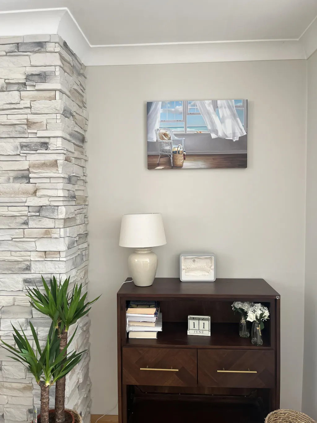
A white frame feels crisp beside saturated colors, quiet beside neutrals, and airy against darker walls. That versatility is one reason it keeps showing up in homes that look very different from one another. A beachy room, a city apartment, and a pared-back office can all use the same frame finish successfully.
White frames make artwork easier to live with
If you love changing pillows, throws, or accent pieces through the year, white frames are forgiving. They don't lock you into one decorating direction. A white-framed artwork can still work after you switch from warm terracotta accents to cooler blue-gray textiles.
They also help when artwork includes many colors. A darker or more ornate frame can pull attention outward. White usually does the opposite. It creates a border without adding visual heaviness.
Here's the design logic in simple terms:
- For colorful art: White contains the energy and keeps the piece from feeling too loud.
- For muted art: White adds clarity and helps subtle tones stay visible.
- For small rooms: White reflects light visually, so the display feels less dense.
- For mixed decor styles: White acts as a common thread when furniture finishes don't match perfectly.
The preference for this look also fits broader buying patterns. The wall art market outlook from Industry Research projects growth from USD 24,584.71 million in 2026 to USD 39,614.87 million by 2035, and notes that wooden designs account for 25% of sales. That matters here because white frames often sit within that wood-based category and align with the modern, pared-back interiors many people want.
They create cohesion without looking sterile
Some shoppers worry that white frames will feel too plain. Usually the opposite happens. They make a room feel edited.
That's especially true when you group several pieces together. White edges create a visual rhythm, so the collection looks connected even when the subjects differ. A line drawing, a portrait, and a textural abstract can still feel like they belong together if the framing is consistent.
If your taste leans calm and uncluttered, this minimalist wall decor approach is a useful companion read because it shows how restrained framing supports a simpler interior instead of making it feel empty.
White frames don't erase personality. They give it a cleaner outline.
How to Select the Perfect Artwork and Size
Choosing art gets easier when you stop treating it like one giant decision. It's really three smaller ones. First, decide what mood the room needs. Then measure the wall in relation to furniture. Then choose an orientation that supports the shape of the space.

Start with the room, not the art
A lot of sizing mistakes begin earlier than people think. They happen when someone falls in love with a print before deciding what role it needs to play.
Ask yourself what the room is missing.
- A calm bedroom often benefits from softer scenic art, abstract forms, or line-based work with breathing room around it.
- A busy entryway usually looks better with art that reads quickly from a distance.
- A living room can handle more visual complexity because people spend longer there.
Color matters too. If the room already has strong upholstery or patterned rugs, artwork can act as a balancing element instead of another loud layer. In a quieter room, the art can become the source of movement and contrast.
One practical way to narrow choices is to shop by palette rather than by subject. Filters that sort by color help when you know your room needs warm neutrals, green accents, or monochrome pieces more than you know whether you want abstract art or outdoor scenes.
A grouped arrangement can also solve awkward wall shapes. If you're considering a multi-piece display rather than one oversized work, this three-piece wall art guide can help you think through spacing and composition.
Use the wall and furniture together
The most reliable sizing guideline is the 2/3 rule. According to the wall art size guide from Nations Photo Lab, framed artwork should occupy 60 to 75% of the furniture width beneath it. The same guide says the artwork center should hang 57 to 60 inches from the floor, or 6 to 10 inches above furniture.
That means a wall over a sofa isn't measured as a blank rectangle. It's measured as a relationship between the sofa and the art.
A few quick examples make this easier:
| Furniture situation | What to aim for |
|---|---|
| Art above a sofa | Total framed width should cover about 60 to 75% of the sofa width |
| Art above a console | Keep the piece visually tied to the furniture, not floating too high |
| Art on an open wall | Hang with the center around standard eye level |
One detail people miss is frame thickness. The same source notes that frame dimensions can add 1 to 3 inches to the total footprint. So the framed size, not just the print size, is what should guide your planning.
This short video gives a helpful visual demonstration before you put holes in the wall:
If a piece looks too small on the wall, it usually is. Your eye notices undersized art immediately, even when you can't explain why.
Choose orientation with intention
Vertical art helps when ceilings feel low or when you're decorating narrow wall sections between windows, beside shelving, or in an entry. Horizontal art works well above beds, sofas, and long sideboards because it mirrors the shape of the furniture.
Square pieces are useful when the wall area is compact but you still want presence. They also work nicely in pairs.
If you're buying standard-size prints, there's a reason some dimensions show up everywhere. The Fortune Business Insights wall art market report notes that 8×10 in, 11×14 in, and 16×20 in are top-selling print sizes and together account for over 80% of consistent monthly sales on major e-commerce platforms. Those sizes are popular because they fit common framing formats and are easy to place in real homes.
A Guide to Materials and Print Quality
Two pieces can have the same image and look completely different once they're printed and framed. Buyers often focus on the artwork first, which makes sense, but material choices decide whether the finished piece feels flat, polished, soft, textured, casual, or gallery-like.

What the frame and paper change
Start with the frame itself. White-framed art can lean warm, cool, smooth, or lightly tactile depending on the finish and construction. A clean white wood frame often feels more grounded than a glossy synthetic-looking white because it still carries a subtle material presence.
Paper choice changes the mood just as much. Satin photo paper tends to look sharper and slightly more luminous. Textured matte paper usually feels softer and more artisanal. Neither is automatically right. It depends on the artwork.
A simple comparison helps:
| Material choice | Visual effect | Often suits |
|---|---|---|
| Satin photo paper | Crisp detail and a smoother surface | Photography, graphic work, clean modern pieces |
| Textured matte paper | Soft surface and more tactile character | Painterly art, organic abstracts, quiet neutrals |
| White wood frame | Bright, structured border | Minimal, Scandinavian, coastal, transitional interiors |
If you're working with original photography or digital artwork you plan to print, file quality matters before paper ever enters the picture. Photographers and designers who want cleaner print output may find this comprehensive guide to RAW workflows useful because it explains how image preparation affects tonal control and detail.
For shoppers comparing frame finishes, natural wood frame styling ideas can be a helpful contrast. Seeing where natural wood excels often makes it easier to tell whether white is the cleaner fit for your room.
Why matting matters more than most buyers expect
Matting isn't just decorative spacing. It affects both preservation and presentation.
According to All American Printing's framing guidance, professional-grade 8-ply to 10-ply white mats are important for museum-quality framing because they help prevent yellowing and reduce light diffusion that can affect color fidelity. The same guidance notes that off-white rather than pure white can reduce glare under artificial light.
That explains why a well-matted piece often looks calmer and more refined even when the viewer can't name the reason.
Consider what matting does in practice:
- Creates breathing room: The artwork doesn't feel cramped against the glazing.
- Improves legibility: Fine details feel easier to see because the border separates the image from its surroundings.
- Softens transitions: Off-white matting blends more gently with many wall colors than bright white does.
- Adds perceived value: The whole piece reads as more considered and more permanent.
A good mat doesn't compete with the artwork. It quiets everything around it.
Material quality also matters for longevity. Sustainably sourced wood, stable print surfaces, and protective packaging aren't flashy details, but they affect how the art looks after months and years on the wall, not just the day it arrives.
How to Style White Frame Wall Art
Styling white frame wall art is less about finding one perfect formula and more about choosing the right role for the piece. Sometimes art should anchor a room. Sometimes it should soften it. Sometimes it should connect several scattered elements so the whole space feels intentional.
If you want a broader foundation before styling, this primer on understanding home design principles is useful because it frames art as part of balance, rhythm, contrast, and proportion rather than as an afterthought.
Build a gallery wall that feels calm
A white frame is especially helpful in gallery walls because it gives many different artworks one visual language. You can mix abstract prints, photography, botanical studies, and sketches without the arrangement feeling chaotic.
The key is to decide whether you want the gallery wall to read as structured or collected.
A structured look usually works best with aligned outer edges, repeated frame sizes, and tighter color relationships. A collected look can mix dimensions and subjects more freely, but white frames still keep the wall from feeling messy.
Try this approach:
- Start with the largest piece near the center or slightly off-center.
- Place supporting pieces around it so the grouping feels balanced, not perfectly symmetrical.
- Keep spacing visually consistent even if the frame sizes vary.
- Use repeated tones across the art so the arrangement has a quiet thread tying it together.
If you want ready-made inspiration for grouping pieces, gallery wall art set ideas can make the planning stage easier.
Let one piece carry the room
A single white-framed work can be powerful when the room already has enough texture through curtains, rugs, upholstery, or architectural detail. In that case, one larger piece often feels more confident than several smaller ones.
This works especially well in these spots:
- Above a bed: Choose art that spans enough width to feel connected to the headboard.
- Over a console table: Use the frame to create a crisp focal point near a mirror, lamp, or bowl.
- At the end of a hallway: One well-placed piece can pull the eye forward and make the passage feel finished.
When the artwork is subtle, the frame becomes part of the softness. A misty artwork in a white frame can almost feel like an extension of the wall, which is lovely in bedrooms and reading corners.
Match the art to the room style
White frames are adaptable, but the artwork inside should still respond to the room around it.
| Interior style | White-framed art that often fits |
|---|---|
| Scandinavian | Minimal line drawings, pale landscapes, restrained abstracts |
| Coastal | Seascapes, dune photography, washed blues, sandy neutrals |
| Modern farmhouse | Botanicals, vintage-inspired studies, soft black and white photography |
| Contemporary | Bold abstract forms, graphic photography, high-contrast compositions |
A few room-by-room cues help too.
In living rooms, go for presence. The art should hold its own against the scale of the sofa and surrounding furnishings. In bedrooms, softer subject matter usually works better because the room asks for less visual tension. In entryways, choose art that introduces the home's tone quickly. A clean white frame helps all three spaces feel connected even if the subjects vary.
There's also a commercial side to this. White frames suit offices, hospitality settings, and waiting areas because they look orderly without feeling severe. In care-based environments, framing consistency can serve a practical purpose as well as an aesthetic one. The Modern Memory Design overview of memory care art framing notes that consistent framing with resident-specific imagery can reduce navigation errors by 40% while improving calm. That's a reminder that frame choices can influence how people move through a space, not just how the space looks.
Ordering Care and Troubleshooting
The final stretch is where hesitation often returns. You've chosen the art, the size, and the frame, but small worries creep in. What if it arrives and looks smaller than expected? What if you damage it while moving? What if the gallery wall goes crooked?
What to expect when ordering
Ordering framed wall art tends to feel smoother when you stick with standard sizes and confirm the final framed dimensions before checkout. That's one reason common formats are such safe choices. As noted earlier, 8×10 in, 11×14 in, and 16×20 in are the most consistently sold standard print sizes across major online platforms, according to the earlier Fortune Business Insights market report.
For practical shopping, one option is Printano, which offers framed art prints, unframed prints, textured paper options, multiple orientations, free worldwide shipping, order tracking, and a 30-day return policy. For buyers who get overwhelmed by too many choices, browsing by color, orientation, collection, or artist can make the final decision more manageable.
Simple care that keeps art looking crisp
Framed prints don't need complicated maintenance. They need consistency.
- Dust gently: Use a dry, soft cloth on the frame surface.
- Avoid direct harsh sunlight: Bright light can be beautiful, but constant exposure isn't ideal for printed surfaces.
- Keep away from damp zones: Bathrooms and poorly ventilated areas can be tricky unless the product is specifically suited for them.
- Check wall hardware occasionally: A secure hang matters as much as careful cleaning.
If you ever need to move or store framed art temporarily, it helps to review how professionals secure items with bubble wrap so corners and glazing stay protected during transport.
Fix common problems fast
Some of the most common art problems are easy to solve once you know what caused them.
The art looks too small.
Add scale around it. Move it above narrower furniture, pair it with a second piece, or replace it with a larger format. Small art can be beautiful, but it usually needs context.
The gallery wall won't line up.
Lay everything out on the floor first. Then transfer the arrangement carefully and work from a central anchor point rather than from one outer corner.
You're stuck between two options.
Choose the piece that fits the room's job, not just the piece you admire in isolation. Art for a bedroom should behave differently from art for a dining space.
For hanging help, this wall art hanging guide is a practical next step when you're ready to measure, mark, and place everything with more confidence.
Bring Your Walls to Life With Confidence
White frame wall art works so well because it solves several decorating problems at once. It gives artwork a clean edge, supports many interior styles, and makes a room feel more settled without adding visual clutter. Once you pair that flexibility with the right scale, better materials, and thoughtful placement, the whole process becomes less intimidating.
The most useful ideas are also the simplest ones. Choose art that matches the room's mood. Size it in relation to furniture, not just the empty wall. Pay attention to paper, frame finish, and mat quality because those details shape how the piece feels in real light. Then hang it with intention so it looks connected to the room, not dropped onto it.
A blank wall doesn't need a perfect answer. It needs a well-considered one.
If you're ready to move from ideas to actual artwork, browse the curated collections, color-based filters, and framed print options at Printano. It's an easy way to compare styles, sizes, and finishes while keeping your wall, furniture, and room mood in view.